
Say you’re launching your new brand this year.
Maybe you just started a small clothing line, or you might even promote self-care products.
Regardless of the project, you want to have an outstanding logo and design.
How do you do that?
By using cursive fonts.
But what are the best cursive fonts in 2023?
Before diving into the article, let’s review cursive fonts and how they can help your business.
- Product Reviews (Overview)
- An Overview of Cursive Fonts
- Product Reviews
- 1. Best for Advertising – Broadley
- 2. Best for Publication – Aguafina Script Pro
- 3. Best for Casual Writing – Monarda
- 4. Best for Branding – Rampage Monoline
- 5. Best for Commercial Use – Mistral
- 6. Best for Marketing – Hoodson Script
- 7. Best Overall – Allura
- 8. Best for Long Distances – Mission Script
- 9. Best for Customization – Fancier Script
- 10. Best for Social Media – Billie Sight
- Value Editorial & Buying Debates
- Frequently Asked Questions
- Wrapping Up
Product Reviews (Overview)
We’ve included an overview of our top picks below. For detailed information on each pick, scroll down.
- Best for Advertising – Broadley
- Best for Publication – Aguafina Script Pro
- Best for Casual Writing – Monarda
- Best for Branding – Rampage Monoline
- Best for Commercial Use – Mistral
- Best for Marketing – Hoodson Script
- Best Overall – Allura
- Best for Long Distances – Mission Script
- Best for Customization – Fancier Script
- Best for Social Media – Billie Sight
An Overview of Cursive Fonts
When designing a logo, you want to stand out.
Cursive fonts are a fantastic way to differentiate your brand.
You can choose from various calligraphy options, but we’ll break down the top fonts that provide some pizzazz to your company, cards, or invitations.
What Is a Cursive or Script Font?
Cursive is a style of handwriting dating back to the 16th century.
With the advancement of computers, penmanship has become less used.
Cursive helped people write faster and make handwriting look more appealing.
Most computer fonts are designed by hand, but cursive fonts look like they were hand-drawn.
The fonts can be calligraphic or brush-based.
So if you want a font that looks like someone’s writing, look no further.
Cursive fonts bring humanity and flair to modern designs.
Several famous brands use cursive fonts, such as Kleenex or Sharpie.
When To Use Cursive Fonts?
Cursive fonts fit certain companies better than others.
You’ll find cursive fonts in the food and drink business.
Hospitality, health and wellness, and beauty are other industries that use cursive to make them stand out.
Tattoo and piercing parlors, retro brands, and other trades are also examples of brands that use cursive.
These fonts add character and emphasis to the brand or wording.
Cursive is visually striking and bold.
For these reasons, cursive is great for displaying texts.
Logo, headline, and billboard designs frequently use cursive to cause potential customers to notice.
With that in mind, you should only use cursive for short words.
These scripts don’t work well with longer text.
You should be able to read the words easily.
For example, you could use cursive as the title, but not for paragraphs of information.
Guidelines and instructions should be in a more legible font.
Product Reviews
Now that we got through some background, let’s move on to our product reviews.
Check out the following sections for more information regarding the best cursive fonts of 2023.
1. Best for Advertising – Broadley
Why We Suggest This
Broadley has some great qualities for those searching for a good advertising font. Broadley causes heads to turn after spotting the cursive on a banner or poster.
- Best For: Magazines, books, greetings, and wedding cards
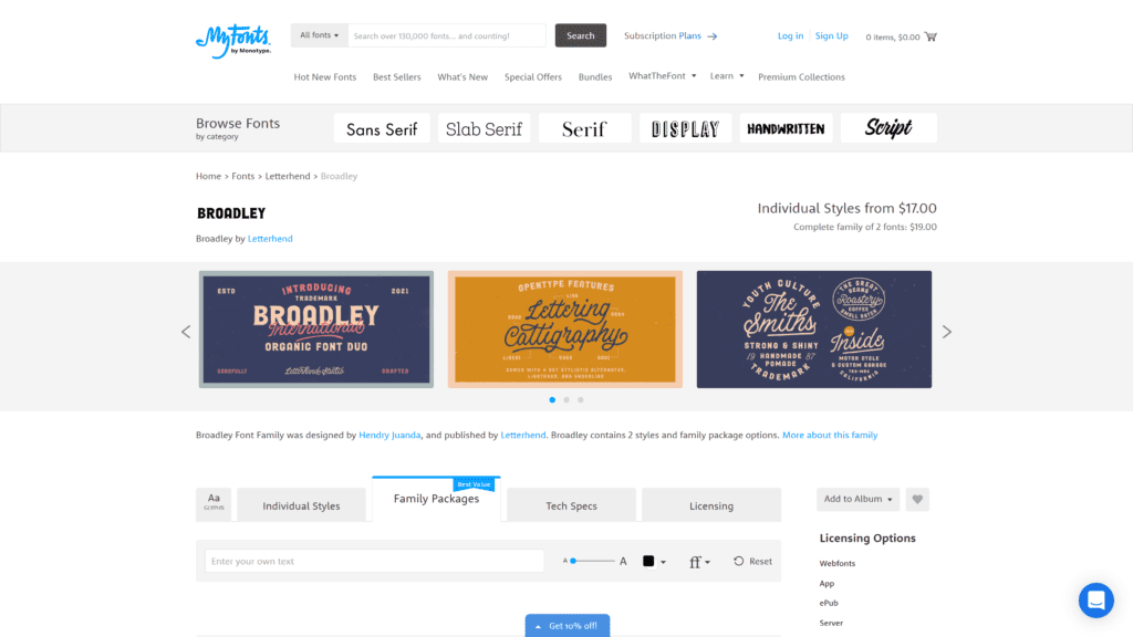
Broadley is a hand-drawn and bold cursive font.
Overview
This script has two styles: serif and script.
You can use Broadley for logos, headlines, and signage; invitations and labels are other popular options for this cursive font.
Our Rating
Broadley gets three stars; we knocked off two stars because people overuse this font.
Plus, the script isn’t as noticeably curvy as other cursive fonts on this list.
Notable Features
What makes Broadley different from other fonts?
- Advertising – You can use Broadley for magazines, books, greetings, and wedding cards. Packaging, fashion, makeup brands, and stationery also stand out when sporting this font.
- 280 glyphs – You can find OpenType variants, such as small caps, in the font. You can customize this font to fit your needs with alternative options.
- Supports multiple languages – Writing in other languages makes Broadley a good choice if you interact with a bilingual audience or send out invitations to your foreign family.
Pros
Here are some benefits when using Broadley for designing.
- Playfully nostalgic – You can apply Broadley to nearly any application due to its font that makes you recollect moments you may have experienced in the past.
- Vintage aesthetic – The vintage style has a certain charm, causing the audience to return to the style reminiscent of the olden days.
- Perfect for logos and headlines – Make your logo and headline stand out and elaborate on the important stuff below.
- PUA encoded – What does PUA mean? Fonts encoded in private use areas mean you can access all the special characters in Windows and Mac. You have more abilities at your disposal.
- Formal and widely compatible – Even though Broadley has fun qualities, you can use the font for more serious applications. The font works with whatever project you have in mind, both personal and professional.
Cons
On the other hand, we have some downsides to Broadley.
- Often overused – We had to take off some points for being popular amongst users, meaning that you won’t have a unique design. So, Broadley isn’t the best choice when so many other people opt for this font.
- Not the most suitable for small devices like mobile phones – Broadley can be hard to read for those using mobile devices. Not to mention, it’s in all caps which doesn’t suit everyone.
Is Broadley Hard To Use?
Broadley is no hassle.
Use a program that supports OpenType features and Glyphs panels, like Adobe apps.
That way, you can see and tap into all the font variations and create a cool design for your project.
Pricing & Plans
You can purchase Broadley with available family packages.
Otherwise, you can get one of the best cursive fonts on myfonts.com individually for $17.
On Creative Market, Broadley increases to $25.
Our Take
Broadley doesn’t have as strong of a design as some of the following on the list.
Despite that, Broadley has some great qualities for those searching for a good advertising font.
Broadley causes heads to turn after spotting the cursive on a banner or poster.
2. Best for Publication – Aguafina Script Pro
Why We Suggest This
Aguafina Script Pro is a great cursive font for those needing noticeable text in their publications. It has a striking design that will cause anyone to notice.
- Best For: Making outstanding designs
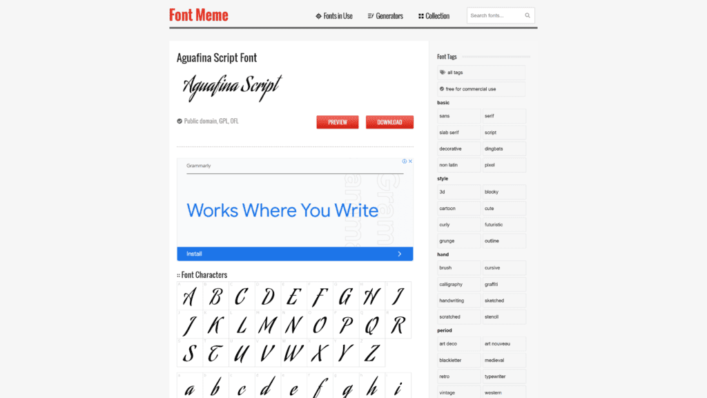
Aguafina Script Pro is a decorative font that’s free for commercial use.
Overview
Bold lines enunciate Aguafina Script Pro.
The overall font is very reminiscent of art deco or medieval times.
Our Rating
Aguafina Script Pro earns four stars.
This cursive font isn’t perfect (like being hard to read) but has some great features that give it a higher score than the former font, Broadley.
Notable Features
How does Aguafina Script Pro stand out from other fonts?
- Vintage – You can apply the style to any holiday. The grunge aesthetic can be cute and casual for social gatherings.
- Formal – Aguafina Script Pro is an all-around font. You can use it for more formal events, such as weddings. You can label invitations with this awe-inspiring design.
- Unlimited installations for one app title – You can use Aguafina for mobile applications on IOS, Android, or Windows phones for an entire year.
Pros
Here are the positives to consider before purchasing this cursive font.
- Eye-catching – The blocky, nearly cartoon writing forces people to look over to see what the banner says.
- Characters flow into each other well – Aguafina Script Pro has an artistic and graceful style that coordinates together nicely.
- Efficient and legible – Aguafina Script Pro makes good use of space while providing reasonable legibility. You get a readable and unique design with this cursive font.
- Perfect for a book cover and glossy magazine covers – This script works well for professional uses. The formal design conveys knowledge. You can also change the color to whatever fits your needs.
Cons
And here come the negatives.
- It can be hard to read – Depending on the size you opt for, Aguafina Script Pro can be difficult to make out with the flowing letters.
- Lack of wide applications – Consider how Aguafina would look if you use it constantly with the former con in mind. You’ll have to use this font sparingly or risk overwhelming your guests or audience.
Is Aguafina Script Pro Hard To Use?
Aguafina Script Pro has fewer glyphs than Broadley but still supports multiple languages.
Once installed, you get a unique and useful font that works well for packaging and covers.
Pricing & Plans
You can download Aguafina Script Pro for free at fontmeme.com.
However, you can only use it for personal use.
If you need commercial access, then consider myfonts.com.
You’ll have to pay about $30 to unlock the font.
But then you can apply it to whatever project.
Our Take
Aguafina Script Pro can be difficult to read in certain circumstances.
Overall, it’s a great cursive font for those needing noticeable text in their publications.
It has a striking design that will cause anyone to notice.
3. Best for Casual Writing – Monarda
Why We Suggest This
Monarda is unique, fun, and playful. You should use this font for more casual moments. It is one of the best cursive fonts that you can use for several different events.
- Best For: Casual moments
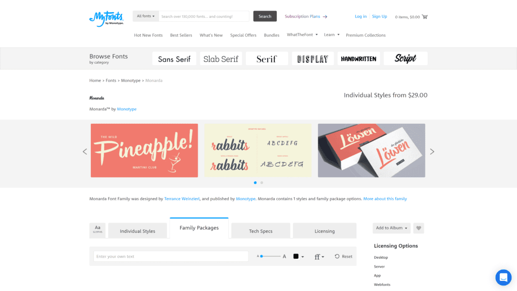
Monarda has loud, splashy brush scripts that give a 1950s vibe.
Overview
With the most glyphs yet (over 800), Monarda takes the cake regarding alternate characters.
Pairing with a readable sans for structure, you have a strong design that matches any application.
Our Rating
Monarda gets four stars as well for its fun energy and multiple uses.
Notable Features
Here’s what you should know about Monarda before committing.
- Confident and compelling – You’ll impact those who visit your site or get a card in the mail. The font is flamboyant enough to be memorable but grounded enough to stand out.
- Wide variety of applications – You can use Monarda for interactive banners, travel blogs, stationery, packaging, advertising, and product branding. Remember to use the font sparingly. Two to three words at a time would be the most effective.
- Beautiful – The bright red flower inspired the personality of this font. Creative and talented individuals will instantly mesh with Monarda.
Pros
Keep reading to learn more about one of the best cursive fonts of 2023.
- Energetic and playful – Monarda is fun and casual, inviting users to learn more about whatever you advertise or promote.
- Rare – Unlike some of the previous fonts, like Broadley, Monarda doesn’t show up all that often. In other words, you’ll have more of an individualized style.
- Screen-friendly – You can read Monarda well regardless of the size of the screen you use.
- Perfect for food and everyday applications – If you’re a restaurant owner or a dedicated foodie who posts about their daily adventures to restaurants, Monarda compliments this lifestyle well.
- Casual yet precise – The overall style isn’t overbearing or too fancy. You can read the font well, and Monarda gives a little spice to a once boring page.
Cons
What are some negatives about Monarda?
- Not perfect for formal writings – As established, Monarda is more lighthearted and free-flowing. If you need a cursive font that works for formal settings, consider another option in this review.
- It only works best when used in large – Monarda is the most effective with larger-sized screens. Even though you can read it with smaller screens, it loses some quality.
Is Monarda Hard To Use?
Monarda is not difficult to use after downloading it for free or purchasing it for more applications.
Pricing & Plans
You can find Monarda on myfonts.com for $29.
You can opt for free use at cufonfonts.com if you don’t need the explicit rights to use this font for business or commercial reasons.
Our Take
Monarda is unique, fun, and playful.
You should use this font for more casual moments.
While there are a few downsides, Monarda is one of the best cursive fonts that you can use for several different events.
4. Best for Branding – Rampage Monoline
Why We Suggest This
Rampage Monoline works for specific projects and earns a high rank on this list of the best cursive fonts. You can use it on multiple platforms.
- Best For: Multiple platforms
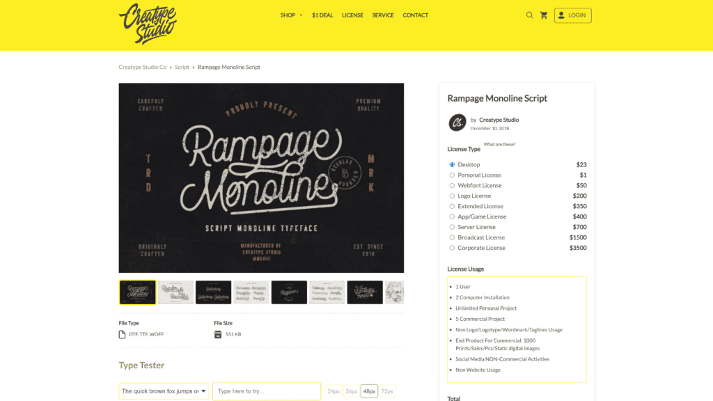
Rampage Monoline is beautiful, sweet, and vintage.
Overview
The movement and grace of this font make for an elegant and stunning display.
Rampage Monoline comes in two versions: regular and rounded.
Our Rating
Rampage Monoline gets four stars.
The font is ideal for large projects with good accessibility.
But this cursive style can be hard to read without as many customization options.
Notable Features
- Perfect for branding projects – You can use Rampage Monoline for wedding designs or social media banners. Advertisements, packaging, and photography are other options that would excel with this font at the lead.
- Works on Mac and PC – You can access Rampage Monoline for all your designs on an Apple or Windows computer.
- Simple installation – No one likes waiting for a download to finish. You can get Rampage Monoline stress-free.
Pros
What are the pros of Rampage Monoline?
- Elegant and graceful – Rampage Monoline has a handwritten design that perfectly encapsulates cursive fonts.
- Create unique logos – Make your company stand out from the rest when you pair Rampage Monoline with your custom logo.
- Vintage touch – Rampage Monoline looks like it’s directly from an old cookbook you’d find in your grandma’s house. That’s not a bad thing.
- It has a stunning display – Rampage Monoline works with large or small screens. You can read it well, and it looks great against multiple backgrounds.
Cons
Rampage Monoline had some excellent perks.
But what about the downsides?
- No flexibility – Despite all the beneficial qualities of Rampage, you can’t make many customizations compared to the other fonts.
- Not so easy to read – Some letters can become muddled in the flowing cursive.
Is Rampage Monoline Hard To Use?
You can apply Rampage Monoline to watermarks, invitations, stationery, and any other project that needs a sprinkling of handwriting.
It has over 300 glyphs to make it exactly how you want.
Despite that, Rampage Monoline only comes in WOFF (web open font) format.
So you have to access an OpenType program.
Once you do, you have uppercase, lowercase, numerals, and punctuations.
You also get multilingual support.
Pricing & Plans
You can find Rampage Monoline on dafont.com for free and for personal use.
A desktop license on creativestudio.co costs $23 while a Webfont license goes for $250.
Our Take
Rampage Monoline works for specific projects and earns a high rank on this list of the best cursive fonts.
You can use it on multiple platforms.
The style is the epitome of cursive fonts.
5. Best for Commercial Use – Mistral
Why We Suggest This
Mistral is an awesome choice if you’re looking for that authentic handwritten script. Although, keep in mind to use Mistral sparingly and only in large letters.
- Best For: Designs that need handwritten script
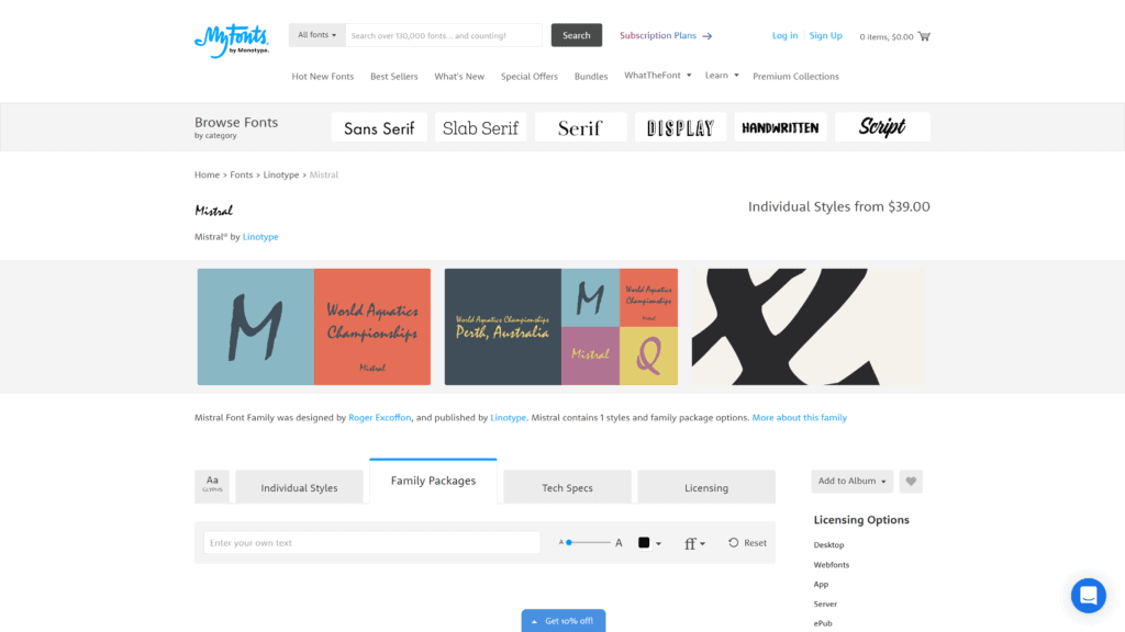
Mistral is the fifth cursive option on this definitive list.
Overview
Mistral has nearly 400 glyphs but only one style.
Despite that, the font has a scribbly, nearly note-taking appearance.
Our Rating
Mistral receives three stars because it has redeeming qualities like many ligatures and languages.
However, it’s hard to read when typed in a smaller size and doesn’t work for long words.
Notable Features
What are the main qualities of Mistral?
- Based on real writing – You’re guaranteed a legit handwritten style with Mistral. The designer heavily influenced the look through his handwriting.
- Brush or heavy felt tip – The bold strokes stand out with unique letter formats. Mistral looks as though it was written by a quill or ink pen.
- Loose running – Cursive allowed writers to scribble their ideas down faster. Mistral enunciates that concept with nearly sloppy letters that flow well together in a coordinating script.
Pros
Here is a list of benefits when using Mistral.
- Great for commercial use – Mistral makes for a fun logo design with its eye-catching look that’s different from the other fonts we’ve seen thus far.
- Outstanding look – The designer crafted the font after being inspired by his handwriting. You get a completely individualized cursive font.
- Has numerous design ligatures – As mentioned before, Mistral has various style variations. You can craft this font to fit your personality without deviating too much from the original design.
- It can be used widely – Whether you need a cursive font for your business or more personal reasons, Mistral checks all the boxes for versatility.
- Supports many languages – Similar to other scripts, you can use Mistral for other languages apart from English.
Cons
Here are the not-so-great aspects of Mistral.
- Not suitable for long writings – Mistral is unique and gorgeous, but consider how you intend to use this cursive font. Since the flow is more scribbly than others, you should only use the script for highlights and not long texts.
- Hard to read when scaled down – Keep Mistral large and bold instead of small. You can barely decipher Mistral when you use the font for smaller letters. (See the screenshot for evidence).
Is Mistral Hard To Use?
Mistral is another OpenType font.
So if you have the necessary programs to download and access this script, you shouldn’t run into any issues.
Pricing & Plans
You can find Mistral on myfont.com.
You can purchase individual plans for $39.
Our Take
Mistral is an awesome choice if you’re looking for that authentic handwritten script.
Although, keep in mind to use Mistral sparingly and only in large letters.
6. Best for Marketing – Hoodson Script
Why We Suggest This
Hoodson Script is a traditional cursive font with many ways to use it for your business, brand, or marketing. It also has something nostalgic about its appearance, making it a solid pick for various applications.
- Best For: Handwritten quotes, packaging, and merchandise
Hoodson Script is a retro cursive font that gives personality to your brand.
Overview
Hoodson Script combines handwritten letters with a bold marker style.
This cursive font works well for handwritten quotes, packaging, and merchandise.
Our Rating
Hoodson Script gets three stars because of its range of uses but forgettable style.
Notable Features
Here’s what to expect before you purchase this script.
- Many ligatures – You can find simplified Latin and normal A-Z with this font. Additionally, you can access numbers, symbols, and other stylistic sets to create your signature logo.
- Social media and greeting card friendly – You could inspire your followers and say hello to loved ones with a bouncy font that keeps your eyes reading more.
- Multiple files – This font has different styles, such as rough, script, and alt. You can gauge which one works to make your logo or label the best it can be.
Pros
Hoodson Script is a solid choice for cursive fonts.
- Features a fantastic typeface – Hoodson Script has a visual design that can offer customizations. The accessories share the same appearance for a cohesive look.
- Comes with complementing marker font – Like Mistral, Hoodson Script hones in on the handwritten marker appearance.
- Vintage style – Hoodson Script has something nostalgic about the appearance, making it a solid pick for various applications.
- Perfect for posters and headers – Hoodson Script is easily legible and perks the attention of passersby.
- Has flair – Hoodson Script is individual enough to where you wouldn’t mistake it for another cursive font.
Cons
Hoodson Script has a few faults. Nothing’s perfect.
- Fewer applications – Hoodson Script works for several different projects, but it’s not universal and has a few limitations.
- Not exactly fresh – This cursive font is the classic cursive style. That said, if you want something unique, then look elsewhere.
Is Hoodson Script Hard To Use?
You need a program to support OpenType features or another alternative.
After that, you shouldn’t have any hiccups using this font.
Pricing & Plans
You can use Hoodson Script for free at dafont.com.
You can also find this cursive font on Creative Market for $19.
Our Take
Hoodson Script is a traditional cursive font with many ways to use it for your business, brand, or marketing.
However, nothing is outstanding about the style.
Hoodson Script isn’t as memorable as the other cursive fonts in this list.
7. Best Overall – Allura
Why We Suggest This
Allura is one of the best cursive fonts because of its no-cost and solid design. You can use it on nearly any template and be satisfied with the result.
- Best For: Personal invitations and business applications
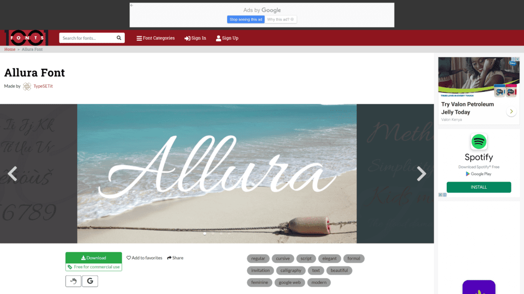
Allura is classic cursive with an elegant and formal design.
This font excels in personal invitations and business applications.
Overview
Allura highlights the beauty of calligraphy with a feminine and modern appearance.
The stylized design makes it perfect for personal and professional uses.
Our Rating
Allura gets five stars!
Why?
You can read Allura easily, use the cursive font for nearly any occasion, and personalize your business.
Plus, it’s free.
Win-win.
Notable Features
Allura has one of the top scores thus far; here are the features you get with your download.
- Stylized – Allura has a distinctive look that works for various uses. The nearly sensual letters combine for a flowing design that always looks professional.
- Legibility – Despite the complex style, Allura remains readable in large formats.
- Alternative designs – You can change Allura to fit your needs with different text modifications.
Pros
What do you gain out of using Allura?
- Maximum flexibility – Allura is a well-balanced font that you can apply and change as much as you want.
- Softer look – Allura isn’t nearly as bold as some previous cursive fonts and subtly enhances the page or paper.
- Can be formal – Allura works well for weddings and business meetings as much as personal branding.
- Suitable for display, package, and advertising – Use Allura for all your commercial needs, and you might see a sales spike.
- Clean and simple characters – Cursive can be difficult to make out, especially in this modern age when typing replaces penmanship. But, you can still see the individual letters in Allura despite being cursive.
Cons
What are a few downsides to Allura?
- Not recommended for extended writing – As with all cursive fonts, be mindful of only using Allura for individual sections and not blocks of writing.
- It does not turn out well on smaller screens – Use Allura largely and boldly. Allura is great on large screens, but mobile users might struggle to see what you wrote.
Is Allura Hard To Use?
You can use Allura for free, for individual or group purposes.
No hidden surprises.
Pricing & Plans
Check out Allura on 1001fonts.com and fontsquirrel.com.
As we mentioned in the previous section, you don’t have to pay anything.
Our Take
Allura is one of the best cursive fonts because of its no cost and solid design.
You can use it on nearly any template and be satisfied with the result.
8. Best for Long Distances – Mission Script
Why We Suggest This
Mission Script is a safe bet for anyone searching for a good cursive font. You can read this text from far away with no issue and apply it to cards, billboards, and other merchandise.
- Best For: Cards, billboards and merchandise
Mission Script is tall and tilts slightly, making it ideal when reading smaller display sizes and from far away.
Overview
Mission Script has many alternatives for the overall display.
You can choose what you want the typography to look like, but overall, the font has a nice bounce and stroke.
Our Rating
Mission Script is another five-star winner, and you can use the versatile cursive font for any project.
The style is modern and cute with not many notable downsides.
Notable Features
We’ve tackled a few cursive fonts at this point.
Why should you consider using Mission Script?
- Different shapes and styles – You can choose how you want to use Mission Script differently with the various alternatives.
- Can use an accent – Cursive fonts are a great way to add a bit of flavor to a logo but not as the finer details.
- Casual and sweet – The way the designer crafted this font brings in an innocent flair that will add cuteness to any format.
Pros
Mission Script has some great perks about the design.
- Can be read in smaller displays – Unlike some fonts on this list, Mission Script remains legible even when dialed back a few sizes.
- Vibrant – Mission Script adds liveliness to whatever design, making a statement amongst the more dull fonts.
- Condensed and sincere – Mission Script has a high-quality air to the font. The script is tighter and controlled instead of flowing freely.
- Has variety – Mission Script is flexible enough that you can use it for almost any project.
- Read at a distance – We talked about the importance of having a script that’s easy to read when navigating a small screen. But what about bulletin boards? Mission Script works for larger applications, making it one of the best cursive fonts.
Cons
Mission Script has some typical hindrances that come when using a cursive font.
- Not suitable for paragraphs – As with all cursive fonts, use Mission Script occasionally to pack a punch. Avoid pages upon pages of sentences.
- Not readable when sized too small – Be hesitant about making Mission Script too tiny. You might encounter some issues with making out certain letters.
Is Mission Script Hard to Use?
Mission Script works in Adobe CS.
Features automatically upload in OpenType applications.
After that, have fun typing away!
Pricing & Plans
You can get Mission Script on cufonfonts.com.
This font is also on allthebestfonts.com for free.
Our Take
Mission Script is a safe bet for anyone searching for a good cursive font.
You can read this text from far away with no issue and apply it to cards, billboards, and other merchandise.
9. Best for Customization – Fancier Script
Why We Suggest This
Fancier Script helps achieve that impressive design and investment if you sell a high-quality product.
- Best For: Those looking for a respectable cursive font
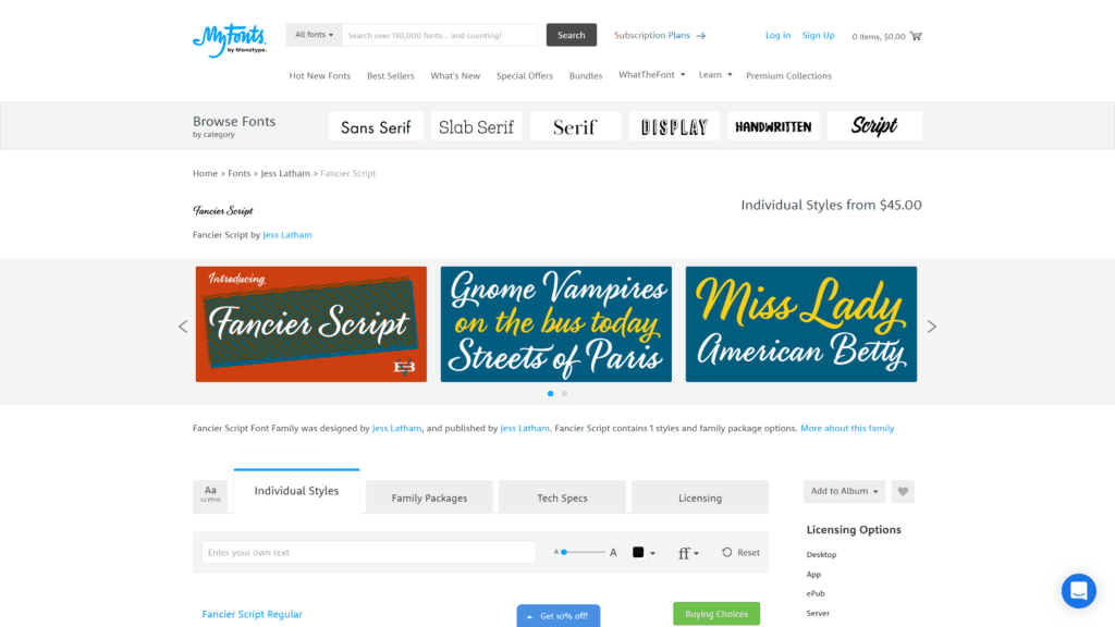
Fancier Script is, well, fancy.
Overview
Fancier Script only has one style.
However, the font is a wonderful option due to its personalization capabilities.
Our Rating
Fancier Script gets four stars, despite the connotation with the name.
Fancier Script would have passed with five if not for the chunk of change you spend before using it.
Notable Features
Fancier Script has a cool background that reflects the style of the font.
- Over 670 glyphs – Fancier Script has one of the highest glyph capabilities, meaning that you can pick and choose what you like or don’t like about the font.
- Inspired by sign painters of the past – Some of the best things in life have a rich history, right? Fancier Script combines text that looks both retro and modern.
- Bold – You want something that causes heads to turn. Fancier Script can help you accomplish that.
Pros
Fancier Script is one of the best fonts for customization.
What other perks come with the purchase?
- Highly customizable – You can choose to customize the script as you type, adjusting the letters and flow to suit your needs.
- Fresh look – Fancier Script stands out amongst the other cursive fonts we’ve seen thus far. The letters flow nicely, and the text looks upper-class and successful.
- Perfect for product packaging – Fancier Script helps achieve that impressive design and investment if you sell a high-quality product.
- It has various open features – After you download Fancier Script, the sky’s the limit for you as the creator.
- Eye-catching – Nothing more to be said here; Fancier Script grabs and holds your attention while reading.
Cons
Fancier Script has a couple of faults, like most cursive fonts.
- Hard to read on a smaller display – Small cursive doesn’t work well and could look sloppy or unreadable. Go big or go home, as we always say.
- Not suitable for long paragraphs – Brighten up a design with Fancier Script as one or two words. Avoid lengthy chunks of text.
Is Fancier Script Hard To Use?
After purchasing the font, you can use Fancier Script on mobile and desktop applications.
The design allows you to make adjustments accordingly.
Pricing & Plans
You can purchase Fancier Script for $45 on myfonts.com.
While a bit more expensive than the other cursive fonts we’ve covered in this article, the customization and style are worth it.
Our Take
Fancier Script nearly met all of the requirements for the best cursive font.
However, the price knocked off a few points.
Otherwise, Fancier Script is ideal for those looking for a respectable cursive font.
10. Best for Social Media – Billie Sight
Why We Suggest This
Billie Sight has a great design that makes a quirky and stunning font. You can apply the cursive script to advertisements or products.
- Best For: Advertisements
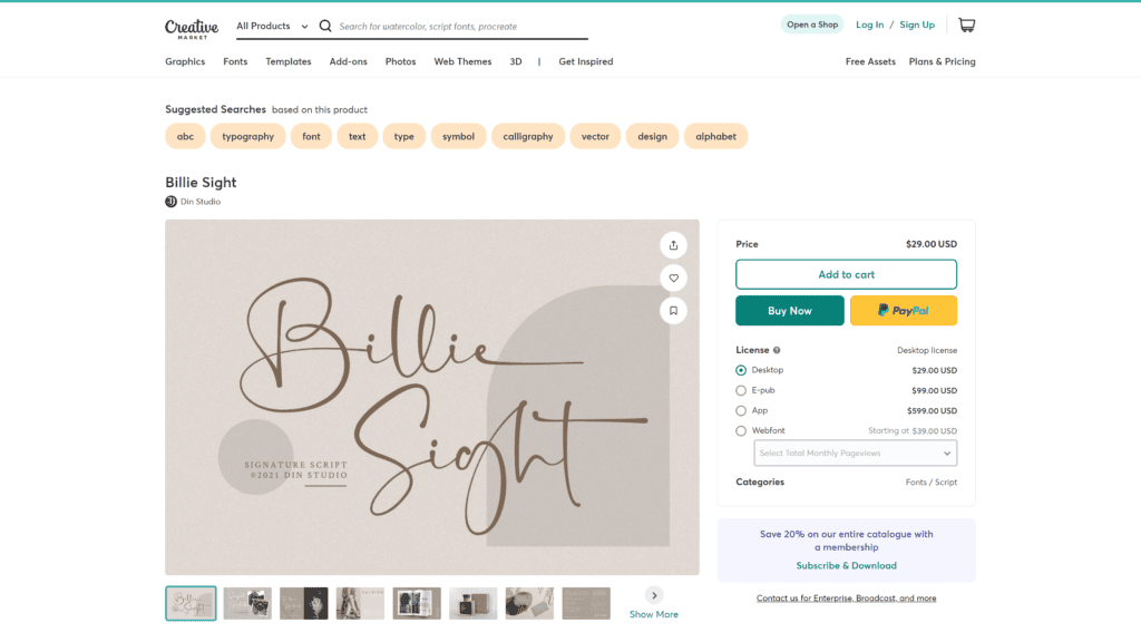
Billie Sight is versatile.
You can use it for invitations, branding, T-shirts, or whatever your imagination formulates.
Overview
Billie Sight is gorgeous.
You can successfully engage guests and audiences.
The font has wonderful strokes and curves that encapsulate high-class.
Our Rating
Billie Sight gets four stars.
While striking, advertisers often resort to this font, meaning your brand won’t be as unique as you hoped.
Notable Features
What are some of the best features for the last cursive font in this round-up?
- Social media friendly – Capture audiences’ attention with Billie Sight. Use the font to highlight a background image or reference a quote.
- Supports 84 different languages – Billie Sight is multilingual, meaning you can tap into audiences that speak different languages.
- Numerals and punctuation – You can make stylistic changes and customize Billie Sight to your needs. You don’t just get letters, but all the other necessary aspects of language.
Pros
Let’s go over the best parts of using Billie Sight.
- Modern – Many of the fonts we covered had a retro or vintage feel. Billie Sight does the opposite, creating a more modernized experience.
- Has elegance and style – The looping letters and curves allow the font to fit several applications.
- Aesthetic look – Billie Sight is pleasing to look at, and your eyes follow the text flawlessly.
- Best for ads and packaging – If you work in the marketing department, Billie Sight is a go-to for one of the best cursive fonts to make your product stand out.
- Visually appealing – Billie Sight has unique loops and letters that make it one-of-a-kind.
Cons
Billie Sight has a few downsides that come with the cursive font territory.
- Not recommended for longer writings – Use Billie Sight for a few words here and there, but not for longer sentences.
- Used by many advertisers – The downside to Billie Sight is that it’s popular for obvious reasons amongst other competing brands.
Is Billie Sight Hard To Use?
Billie Sight has multiple formats and downloads quickly.
Creative Market has different pricing options to correspond with your needs.
Pricing & Plans
You can use Billie Sight for personal use at dafont.com.
You don’t have to pay any fee.
On the flip side, Creative Market sells the font for commercial use for $29; myfonts.com has the script for a little over $20.
Our Take
Billie Sight has a great design that makes a quirky and stunning font.
You can apply the cursive script to advertisements or products.
Value Editorial & Buying Debates
You might feel a little burned out after reading all of that.
But stay with us!
We have some other great points for you to consider before purchasing one of these fonts.
Learn more about helping your business or growing your brand below.
Features To Look for in Cursive Fonts
Cursive fonts are great for logos and provide much-needed visual appeal.
In a digitally focused world with standard fonts, this style provides more personality and character.
Easily Legible
When listing a lot of information, opt for another font.
Use short words in cursive and make sure the lettering looks right.
You want the design to be distinctive and easy to read.
Cursive is an accent, not the main course.
Remember to not add space between the characters so the font flows together.
If not, your logo will look disorganized.
Visual Appeal
Cursive should have a natural flow and energy.
Apply cursive alongside supporting elements, like pictures or other wording.
Cursive should complement the main text or logo.
It adds expression and tone to your brand.
You can still be creative and have fun.
Where You Will Use Cursive Fonts
Are you creating an individual logo or designing an entire billboard?
Ask these questions before deciding on a font.
You can customize cursive to make the font unique to your brand.
Even if you create a massive sign, never use all caps.
The logo will be hard to read and throw off your end goal.
Frequently Asked Questions
Are you still a little lost with how you should use cursive fonts?
No worries.
Look at the next section to see if that helps clarify things.
How do I use cursive font?
Pairing cursive fonts with normal text help tell your story and establish authority.
Combine cursive with other low-visual information fonts.
Use symbols but let scripts do the main work.
You can add a splash of color to emphasize the mood.
Choose complementary shades to make the design cohesive.
Keep it simple.
Cursive fonts are great to deliver visual appeal on their own, and you don’t have to go crazy with the extraneous details.
Play around to see what you like and don’t like about script fonts.
For example, you could try capitalizing specific letters.
What font is used for cursive?
Cursive is scrawling and sometimes, admittedly, complex.
Cursive is almost an art form on its own, but can easily become illegible.
Think about the function over attributes.
Cursive adds a formal touch when using different typefaces.
Luxury or high-end brands use cursive fonts as a way to describe their mission and market to an audience.
All of the above fonts are used as cursive options on the computer, but you can explore many more on the internet.
What is the best cursive font in Microsoft Word?
Microsoft Word has hundreds of cursive fonts available to use.
Lots of people don’t recognize the names of these fonts.
Or they don’t have time to browse them all.
Here’s a list of some of the best cursive fonts for your word document, ready to use and format your text in various styles.
Edwardian Script
Kunstler Script
Lucida Handwriting
Rage Italic
Script MT Bold
Segoe Script
Viner Hand
Vivaldi
Vladimir Script
Wrapping Up
Allura takes the number one spot on the list of the best cursive fonts in 2023.
Nonetheless, other fonts like Monarda and Fancier Script had high scores that may have sparked your interest.
Cursive fonts are a great way to add personality to your business and make the product your own.
Look into these fonts or explore others available for free or purchase.
You’ll undoubtedly find one that fits your needs.
But these are some of the best cursive fonts you can find this year to launch your brand on a strong note.