

Are you wondering how to edit bar graph in Google Docs?
Google Docs is a free suite of productivity tools that can accomplish many of the same functions as other premium applications.
Your gathered data can be displayed as a graph using the spreadsheet application in Google Docs, greatly simplifying the visualization of the data.
Unfortunately, many people are unaware of bar graphs and how Google Docs uses them. As a result, this post will explain how to create and edit a bar graph in Google Docs.
- What You’ll Need To Add & Edit Bar Graph In Google Docs
- How To Create A Bar Graph In Google Docs: Step-By-Step Instructions
- How To Edit Bar Graph In Google Docs: Step-By-Step Instructions
- How To Insert A Bar Graph From Sheets: Step-By-Step Instructions
- 4 Types Of Google Docs Graphs & Types Of Bar Graphs
- Similar Tutorials To Check Out
- Wrapping Up
Can You Edit a Graph in Google Docs?
Bar Graphs are a visual representation of relational data in Google Docs. Double-click the chart that needs to be modified, then select Customize. Make the desired modifications by clicking Chart style.
What Edits Can You Make to a Graph in Google Docs?
You can alter the colors, borders, shapes, transparency, and typefaces of your chart in addition to adding gridlines to make the data easier to read.
Gridlines can be applied to a variety of chart types, including lines, regions, columns, bars, scatter, waterfalls, histograms, radars, and candlesticks.
What You’ll Need To Add & Edit Bar Graph In Google Docs
If you want to add graphs and charts in Google Docs, you’ll need the following tools:
Google Docs: Although the Google Docs app for smartphones works just fine, you will need to utilize a web browser on a PC. You will find it simpler to add and edit bar graphs in Google Docs.
Google Sheets: You’ll need access to Google Sheets, so you can edit the graph in detail, input numbers, change the colors, borders, shapes, transparency, typefaces, and much more.
How To Create A Bar Graph In Google Docs: Step-By-Step Instructions
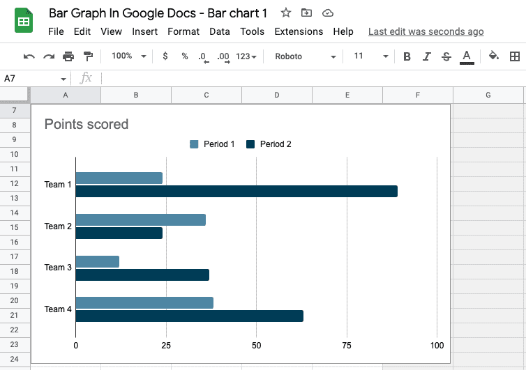
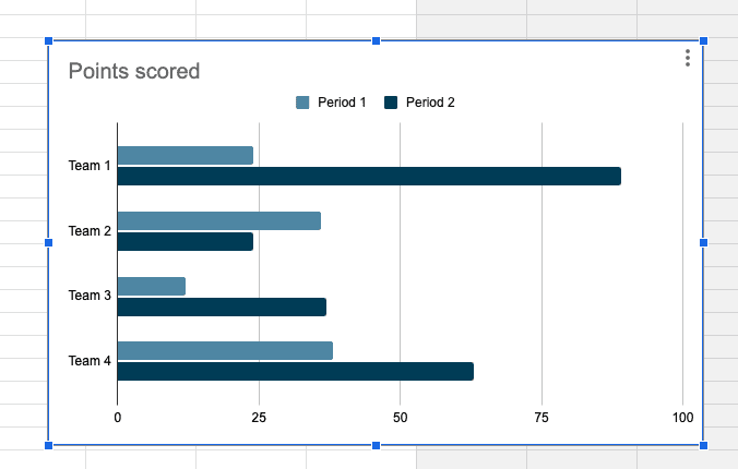
Bar Graphs are a visual representation of relational data in Google Docs. The bar graph presents enormous amounts of data in an image. It plots the data along an x-axis and a y-axis, or horizontal and vertical, respectively.
Relatively speaking, a bar graph is preferable than a table for showing data comparisons. When wondering how to edit bar graph in Google Docs, follow the steps below:
Step One: Go to your Google Docs and select the document you wish to create a graph in or create a new one by clicking the “+” sign, depending on your preference.
Step Two: Click the “Insert” button in your document to bring up a drop-down menu. Locate the “Chart” tab in the drop-down menu and click it to bring up a sidebar menu with options for creating a graph.
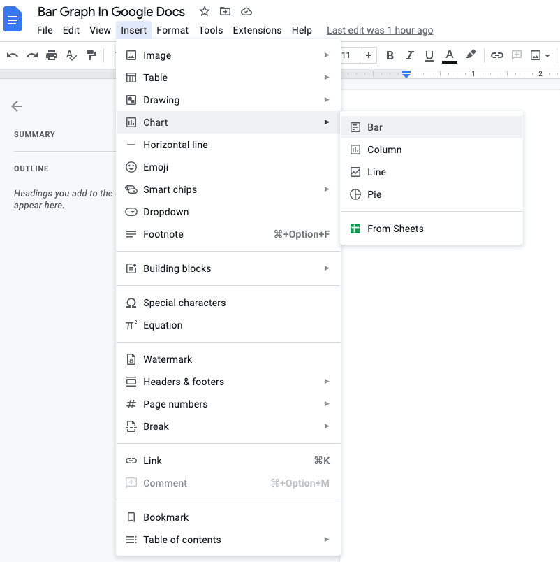
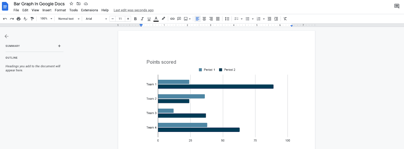
Using the sidebar menu, you can make a pie graph, bar graph, column graph, or line graph. When you choose the type of graph you wish to make, a blank graph that you can customize in Google Sheets is inserted.
Whenever you introduce a graph with a generic data set, a link to a Google sheet where you can change the graph’s data is automatically created.
Read on to learn how to edit bar graph in Google Docs.
How To Edit Bar Graph In Google Docs: Step-By-Step Instructions
Now it’s time to learn how to edit bar graph in Google Docs, and to do so, follow the tips and instructions below:
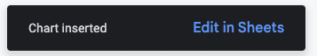
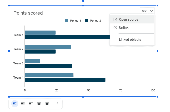
Step One: A pop-up menu with the feature to “Edit in Sheets” displays at the bottom left of the screen when you enter your graph. The link options will appear when you click that button or if you right-click on your bar graph.
A drop-down menu will show when you hit the chain link button, giving you a choice to “Unlink” the bar graph in your document, “Open source” to the associated Google sheet, or “View all Linked Objects.“
You’ll see the changes updated depending on what you select.
Step Two: You can change your bar graph by selecting “Open source,” which will open the related sheet in a new tab.
You may also select “Linked objects” to view and edit every linked sheet in your project if you wish to generate multiple graphs.
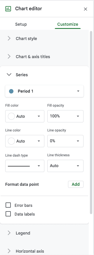
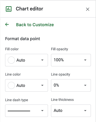
You can alter the backdrop, colors, typefaces, lines, transparency, and forms of your graph while it is open in Google Sheets.
The “Customize” option can be found by right-clicking the chart in your spreadsheets.
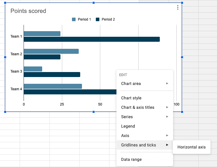
Step Three: You can click “Gridlines” and change the number or thickness of your gridlines if you wish to add or modify them.
You can pick “Customize” once more and then select “Chart style” to alter the graph’s backdrop or typeface.
Choose the various elements of your graph from the “Chart style” option to personalize and resize them as necessary.
You can alter the background color and transparency as well as the font styles and colors.
Step Four: Left-clicking on your graph will reveal a menu with various placement options if you wish to move it somewhere else in your project.
Any text you had before inserting your graph is automatically moved to the same line.
You can decide whether you want your graph to be “In line” with your content, “Wrap text” around it, “Break text” so that it appears on a distinct line, “Behind text” so that the text is hidden from view on the graph, or “In front of text” to show it.
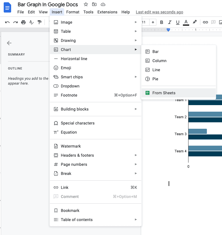
How To Insert A Bar Graph From Sheets: Step-By-Step Instructions
If you have an existing data set sheet that you would want to use for a graph in your project, you can go back to the “Insert” menu, “Chart” tab, and graph options and choose “From Sheets.”
This displays a selection of the spreadsheets you have on hand that you may insert to make a chart. When you choose a spreadsheet, Google Docs will automatically find charts to link to your document.
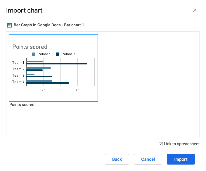
When you have chosen the sheet graph you wish to insert, click the “Import” button in the bottom right corner.
You can update the graph data or modify your article after importing your graph from sheets.
To maintain the present data, “Unlink” the document graph from the spreadsheet chart if you want to keep the embedded version as is on the document while making changes to the original spreadsheet.
4 Types Of Google Docs Graphs & Types Of Bar Graphs
You can create the following graph kinds in Google Docs:
- Bar: You can compare measurements by seeing them side by side in a bar graph. These measurements may be for specified time periods or may include additional metrics to monitor important changes over time.
- Column: The ability to build metric clusters is another advantage of column graphs over bar graphs. These column clusters allow you to compare measurements both in and out of the cluster.
- Line: Data points on a line graph can be used to display more minute variances in data at spots where lines may cross. A line graph allows you to monitor both significant and minute changes in data over time.
- Pie: A pie graph displays the relative values of the component elements that make up an entire thing. You can use these to illustrate percentages or ratios even though they might not display changes over time. Bar graphs come in three different categories:
- Vertical: The lengths of the vertical bars, which are proportionate to the numbers in the vertical bar chart, show the numerical value of study variables based on categorical data grouped on the x-axis.
- Horizontal: Comparing nominal variables is frequently represented visually using horizontal bar charts. With the use of horizontal rectangles, this tool displays long data labels with space remaining for textual content.
- Stacked: A vertically stacked bar chart uses vertical bars to compare several data factors. With the help of this statistical tool, data categories can be organized into stacks where each bar represents the total number of subdivisions in a data collection.
Similar Tutorials To Check Out
- How to Make a Timeline on Google Docs: With the help of Google Docs timelines, you may build team cooperation and finish projects on schedule despite geographical limitations. We’ll teach you how to make a timeline on Google Docs.
- How to Create a Calendar in Google Docs: The Google Docs calendar templates can help you run a marketing campaign, create a schedule while working from home, and more. We’ll demonstrate how to create a calendar in Google Docs.
- How to Make a Menu on Google Docs: We’ll walk you through creating a menu in Google Docs and how you may alter the pre-built drop-down menus.
Wrapping Up
As you can see, creating and editing a bar graph in Google Docs is simple, and it’s a useful tool for arranging and presenting data.
A bar graph is added using the “Insert” tab on the menu bar, and this graph is then updated in Google Sheets.
When editing, the user can alter the graph as needed to suit their needs and preferences. The graph is transferred into Google Docs with the necessary modifications.
As you can see, creating a bar graph in Google Docs is quite simple and a great way to organize and present data.
To avoid any problems, make sure you carefully follow all the instructions. The aforementioned instructions can also be used to make magnificent pie and column charts.