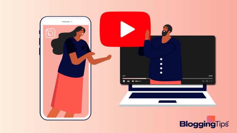

From its early days as a photo-sharing platform, Instagram has grown to become an efficacious marketing tool in the hands of businesses and content creators alike.
But the power of Instagram doesn’t solely rely on individual posts.
Have you ever wondered why some Instagram accounts look and feel more appealing than others?
It’s the ability to create excellent visual content systematically tied together to tell a comprehensive narrative. That’s what Instagram grid is all about.
And when it comes to social media marketing, there are many ways to deliver excellent visual content. On Instagram, the grid layout is second to none.
This guide covers the basics of Instagram grid layout, its benefits, and how to create an audience-delighting grid layout.
We also included some excellent examples of Instragram grid layouts to give you a headstart.
Instagram Grid Layout: The Basics
Besides those followers you earn via friends and familial relationships, the appearance of your Instagram feed is a critical factor to strangers when deciding to click the follow button on your profile.
You may have a great Instagram bio. You may even be able to increase your Instagram post impressions.
But yet fall short of getting more followers. That’s when your Instagram feed looks unplanned and shabby.
So how do you create an Instagram feed that people can’t simply walk past? Embracing Instagram grid layout is your answer.
And in this guide, we’ll show you the art and science of it. Let’s go.
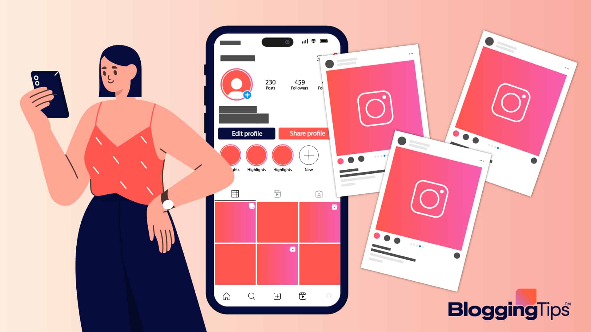
What’s Instagram grid layout?
The Instagram grid layout is at the center of your profile page.
It’s where users land when they tap on your profile, and It’s the face and body of your Instagram marketing effort.
The secret to captivating Instagram aesthetics is making those little squares count with a structure that ensures consistency.
A grid layout helps you plan your overall Instagram strategy by treating each post that will end up in your feed as part of a complex picture.
Why Instagram Grid Layout?
If you are a casual Instagram users whose mission is to connect with friends and family, you may be less concerned about your grid layout.
But as a brand, business, content creator, or influencer, paying close attention to your profile grid aesthetic can be the difference between getting all the important clicks your profile deserves and losing them.
The exciting part about creating an Instagram grid layout is that there are no boundaries to what’s achievable.
You are only limited by your imagination. And, perhaps, your creativity.
Once you have the right tools, resources, and a bit of ingenuity, you are ready to create an irresistible grid that shines the light on your brand or personal style.
Benefits of Instagram Grid Layout
Still doubting what Instagram feed layout can do for you? Here are some benefits you don’t want to overlook.
Makes A Great First Impression
Instagram grid layout is a great way to make an impactful first impression on your profile visitors.
Committing to a consistent theme and style over multiple posts underlines your authenticity, which drums up viewers’ interest in your account.
Not only that- It shows how organized you are as a personal or business brand and could be why someone decides to follow you on their first visit.
Helps with Content Planning
As much as the Instagram grid layout helps you capture new audiences, it also does help streamline your Instagram content strategy.
It’s not uncommon to get caught in the maze of what kind of content to post next. With an Instagram grid layout, you are always clear about what’s next.
Instagram grid layout gives people a hawk-eye view of the type of content you post. Grids that follow a consistent pattern help existing and potential followers understand your content strategy, and they can predict what to expect.
When users feel, from one glance at your grid, like they know more about your brand or business and can predict your next content, they are more likely to follow you.
And once they like your posts, they won’t hesitate to share with others.
Helps You Stay on Brand
Instagram grid layout helps you stay on brand. Your content is streamlined to a specific style layout. That way, you’ll maintain consistent brand messaging and positioning.
The Instagram grid layout is a great tool to imprint your brand identity in your audience’s brain.
Using consistent brand color, fonts, and imagery gives your audience a cohesive and easy-to-identify personality for your brand.
How well can you make people see the world from your perspective? Instagram grid layout can give you the answer. Successful accounts on Instagram are those that uniquely package their content.
Instagram grid layout Tips
Of course, a polished instagram grid never happens by coincidence. Above design, some planning and background thoughts go into the process.
Here are five tips to help you.
Understand the Big Picture
Before you attempt anything, the first thing you need to do is to familiarize yourself with how the Instagram grid works. We’ve hinted at it above. Here, we’ll dive deeper.
Instagram isn’t like other social media platforms where you can push out one good post after another without diligently looking at their relationship.
Of course, you can do that on Instagram if you aren’t on Instagram for business.
If you are, owing to the visual nature of Instagram, you have to think about how each post will stack up against the others.
In other words, give extra thought to how they’ll appear in your grid, which is the main feature of any Instagram profile.
Once you are ready to thread this part, you’ll start asking yourself questions like;
- What’s the relationship between this post, the previous one, and the one before it?
- What story is my profile narrating
- How do the message, color, and design align with my brand value?
This means planning your content to be an aggregation of thematic and cohesive posts, passing a clear marketing message to your audience.
And what message do you want to pass? That takes us to the next point.
Define Your Brand Personality
Whether you are a content creator or a brand, some unique traits define you.
The ultimate goal of an Instagram grid isn’t just to impress your viewers with your god-like use of filters. It’s to create a unified visual narrative that spells out what you stand for.
You must get two things right to make that happen, your content and your branding.
Your Content
Here’s the big question- what are you looking to share?
The answer entirely depends on your audience. What do they want to see?
For a chef, It’s likely to be photos of the interior of your kitchen, shots of people enjoying your delicacies, maybe some behind-the-scenes, a galore of nutritious foods according to seasons, announcements of your new menu, discounts, and offers.
Some inspirational phrases on healthy living and occasional try-at-home recipe challenges could also make it into the mix.
Whatever your business, the key is to find out valuable content that will interest your audience and have a wide range of them. That way, you can effectively mix and match and avoid the boredom-inducing repetitiveness.
Planning your content also involves deciding on the tone of your content. Think about how you want to come around to your audience, funny, lovely, formal, or serious. It will help you create a unique identity throughout your content.
Your Branding
Once you have a clear direction for your content and its tone, It’s time to ensure they appear best matched.
Here’s where you tie your color, font, filter, and layout to your content. Think about the font and color that befits your content type.
In the restaurant example above, a playful tone with eye-bulging colors and fonts might work fine.
But say you are a recruiting firm for some C-level executives. A fancy font on a colorful rainbow grid and a playful tone is off point.
You need a solid color with a solid font to communicate in a formal tone since you are dealing with professionals.
Keep It Consistent
Consistency is crucial to your posting schedule, so it is your Instagram grid layout.
Creating an excellent Instagram grid means sticking to a unique attribute for your posts, as one off-beat post can throw your whole grid off balance.
Maintaining the same filter and color for your posts is also part of consistency. The filter and color must complement each other for your grid to attain visual equilibrium.
The order of your post is also essential. And posting at the right time or in batches is part of what you should pay attention to.
But don’t get anxious. You don’t have to stress over any of the above. There are tools, free and paid, that you can use. That makes tip #5.
Use Tools to Create, Schedule and Preview Your Instagram Grid
Use Image Editing Tools
Instagram is a visual platform. Every day, millions of new images fly around on the platform. To stand out, the quality of your images must be top-notch. But there’s only much your camera can do.
Fortunately, there are many photo editing software to make your pictures great. Check out these three examples.
Schedule Your Post
You don’t want to worry about missing your post times. You can keep your Instagram grid lively and active while you sleep.
Scheduling tools help you put your Instagram grid content on autopilot. Once you load the photos in order, rest assured they will arrive on your Feed at the right time. Find some of the best scheduling apps here.
Plan and Preview
You shouldn’t stop at scheduling your grid. You must also ensure it’s exactly how you want it to appear before it goes live.
You don’t want your grid disoriented after publishing them. Unfortunately, Instagram doesn’t allow users to rearrange posts once published.
The only thing you can do is take them down, which may be too late for the impression it has already made.
With social media tools like Plannable and Hootsuite, you can preview your layout and drag and drop to rearrange it before posting them.
These tools also double as a post scheduler. Use them to line up your post in the correct order.
5 Instagram Grid Layout Ideas You Can Start Using Right Away
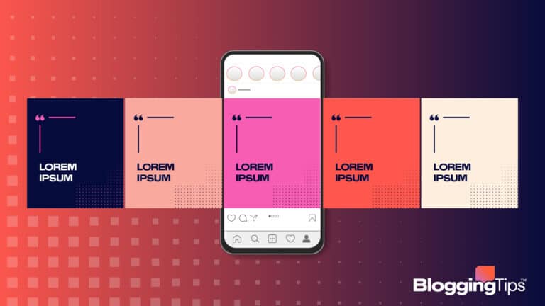
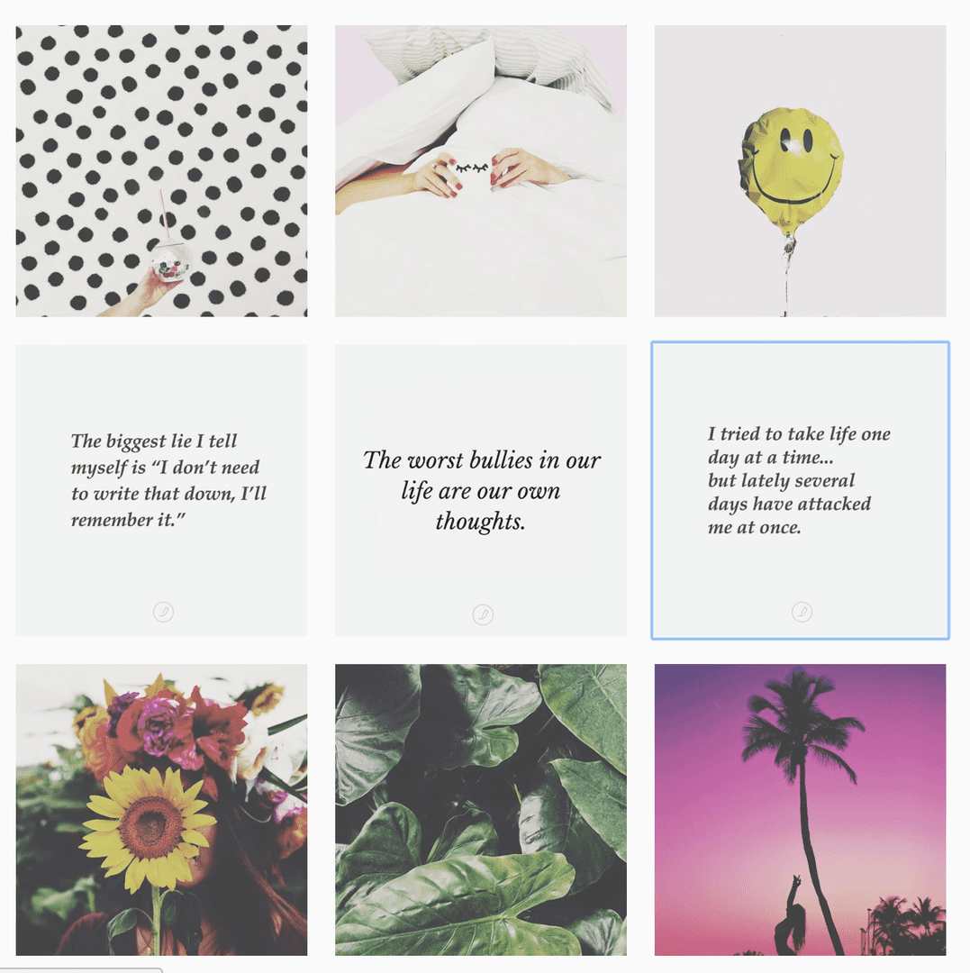
Checkerboard Instagram Grid Layout
The Checkerboard grid layout tops our list because It’s one of the easiest grid layouts anyone can use, no matter the content type, niche and audience.
It’s a simple yet classic pattern and involves going back and forth between 2 colors, text, shots, or any other elements.
An easy way to quickly achieve this is by consistently using text-based posts and alternating the background color. But that’s only the beginning.
Another popular way Instagrammers do this is by mixing text posts with photos by simply posting a quote and an image one after the other.
Of course, you are not restricted to these two styles. You can get creative.
You only need to stay consistent with the background, color, and fonts to make the pattern clear.
Plus, it helps your followers know what to expect next. Since you’ve just dropped an incredible quote, they’ll expect a gorgeous image next.
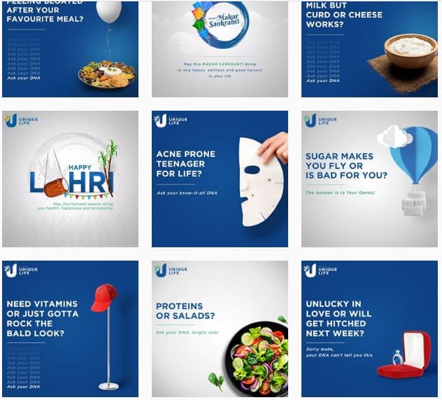
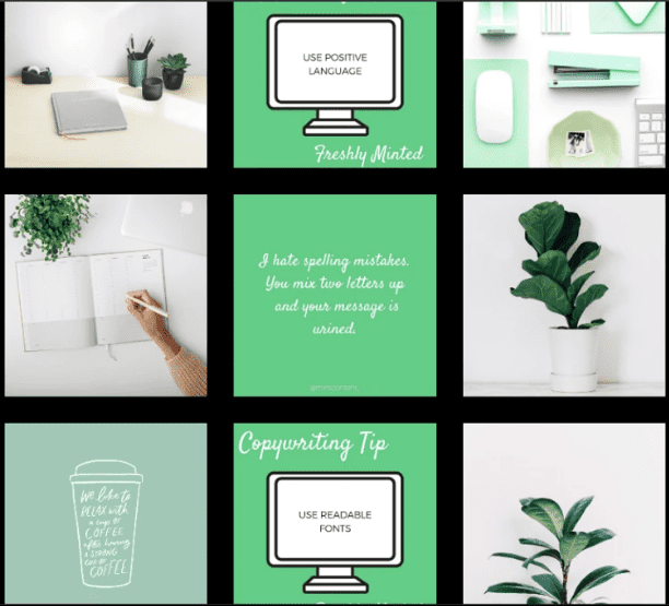
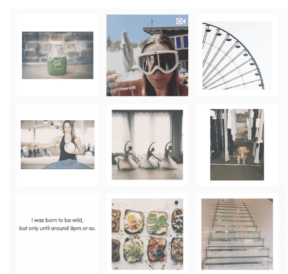
Row by Row/Column by Column Grid Design
Another creative grid design layout is arranging your posts in rows using similar elements. This can be color, style, background, post types, etc.
The three squares per row on your Instagram profile may seem limiting. But there’s more than enough way to get creative with it.
One way is by uniting the posts on each row by some semblance or theme.
This can make a powerful impact as the eyes move from left to right when viewing Instagram feeds, creating the impression of a book or magazine. One story- one line, or one chapter, one row. You get the idea.
The power of this layout lies in sharing a story with each row. The three photos will be related and share a common visual aesthetic.
Similarly, you can unite posts by columns. Only that, this time, you are open to more than three posts. Grid columns can go on forever, which gives you more creative freedom.
But of course, 3 – 5 makes a good pattern. Dragging it beyond that could be less attractive to your viewers. And you can design each column differently. Giving you a thematic vertical appeal.
Puzzle Instagram Grid Layout
One of the trickiest grid layouts to pull off. A puzzle grid requires a lot of creative planning because you have to treat each post not as an entity but as part of a bigger picture.
A puzzle grid is a single image split into multiple images that fit into all squares that make up your Instagram feed without scrolling.
As fascinating as this may sound and appear, It’s something to be done only sometimes, as it requires a great deal of planning and creativity.
The problem with grid puzzles is that It’s difficult to make individual posts make sense independently after you split them.
Hence, when people see your post outside the grid in their feed, they will likely scroll past it as it carries no meaning alone.
Reserve this grid type for when you have a huge announcement to make, a campaign or when starting a new account.
Border Instagram Grid Layout
Whether you feel that your grid needs some work or you think everything is okay, a border is one addition to your grid that will always be perfect.
You can spruce up your grid aesthetics with borders, white, black, orange, mixed, or whatever color.
You can easily create a consistent appearance by adding the same border type to all your posts.
Border frames on your posts, either in square or rectangle, create margins that allow your posts to fit well in the grid.
Borders are a great way to put a twist on your grid and direct the focus on each photo without investing much effort.
It saves time and energy yet frees you up to make your post any way you like it. It’s also easy to mix and match format and orientation.
Rainbow Instagram Grid Layout
Want to break free from routine? Rainbow grids are one-of-a-kind layouts you need. But it takes time, patience, and a great sense of color to pull off.
The rainbow grid allows you to transition your grid from one rainbow color to the next as people scroll down the grid. Here’s the simple on-paper logic- make each row of posts a rainbow shade.
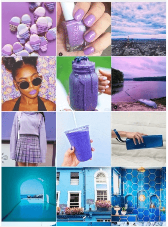
Of course, you can opt for a different rhythm. 3, 6, or 9 photos for each shade are all spectacular. But the more complex it becomes.
You must change the color, filters and edits after every row and plan how each grid transit.
So if you want to avoid sticking to a color, filter, or border, no other grid layout allows you to play with color like this one.
Frequently Asked Questions
How Does The Grid Work on Instagram
Grid is the default view of posts on your profile page. It’s a 3×3 square layout that you can customize its looks and feel as you deem fit. Set you apart from the crowd.
How Do You Make Instagram Grid Better?
There are many ways to make an Instagram grid better. It can be anything you want it to be. You only need to get creative. From color to patterns, themes, content and tone, we’ve explained everything you need in this guide.
Wrapping up
Of course, having a superb grid is just one way to grow your Instagram account. There are other Instagram marketing tips and strategies you can employ.
While you could buy some Instagram followers, it’s always best to grow your instagram followers organically.
From the Instagram layout examples above, you should find one that works for your business, irrespective of your Instagram image size.
We hope you find this guide helpful. If you need further help, feel free to drop us a line in the comment section below.