
Many businesses face a severe problem when they need to present information to their audiences.
Given modern low attention spans, many consumers simply won’t read detailed blog posts, no matter how well laid out they might be or how well-researched their data is.
However, there’s a solution if you need to impart key information to prospective or current audience members: infographics.
But what is an infographic, how does it work, and how can you create one for your brand?
Read on to find out!
- What is an Infographic?
- What Are Infographics Used For?
- Why Are Infographics Used?
- What Are Different Types of Infographics?
- What Makes an Infographic Design Effective?
- How Do You Create an Infographic?
- How To Nail Your Infographic Research
- How To Choose the Right Infographic Colors
- How To Write Compelling Content for Your Infographics
- How To Improve Your Infographic
- How To Promote Your Infographic
- Examples of Great Infographics
- Frequently Asked Questions
- Wrapping Up
What is an Infographic?
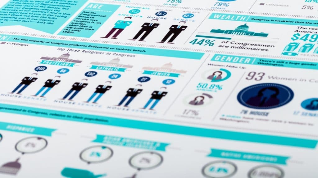
An infographic is an informative chart or graph that includes pictures (graphics) and data or other useful information.
Retail brands, educational institutions, and the government use infographics for specific goals.
What Are Infographics Used For?
People use infographics for a very wide range of purposes, including:
- Selling products (often by comparing two similar products against each other)
- Persuading audience members to see a certain point of view
- Providing complex information in an easy-to-digest format
- Educating audience members
- And more
Why Are Infographics Used?
Simply put, infographics effectively transmit important information to a target audience without that audience having to read through dense paragraphs.
They’re also useful for presenting potentially complex ideas and breaking them down into more easily understandable chunks or steps.
What Are Different Types of Infographics?
While an infographic can be useful and persuasive to your audience, you need to craft the right one for each situation.
Let’s break down the most common infographics you can create for your next presentation.
- Statistical Infographics – Infographics that focus on data above all else.
They leverage layouts and visuals to help presenters tell the full stories behind the numbers, often expressed as percentages.
Such infographics may have more text than others. - Informational Infographics – Infographics divided into sections to communicate a new or specific concept to the audience.
Some informational infographics are employed to overview subjects cleanly and easily.
Many include numbers so audiences can easily follow the infographic’s flow. - Timeline Infographics – Infographics devised as left to right or top to bottom timelines.
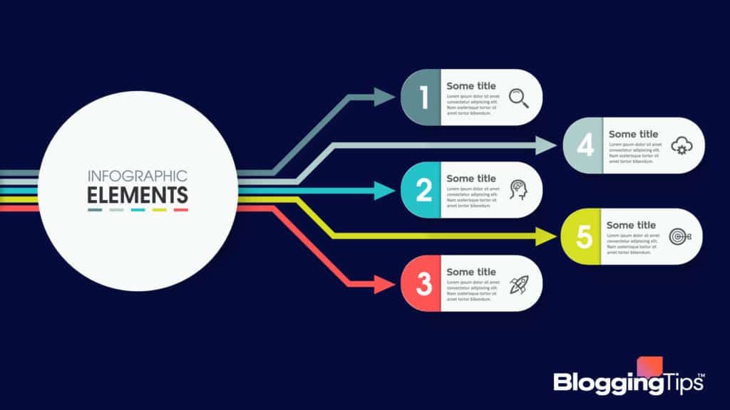
They include lots of visual aids such as lines, photos, labels, and dates to ensure audiences read them correctly. - Process Infographics – Infographics that provide detailed overviews or summaries of steps in a given process.
Each step leads with a header that includes a brief description or paragraph beneath.
An infographic might include photos or graphs for added clarity. - Geographic Infographics – Infographics based on maps.
These maps may be geographically accurate, focus more on national lines, or be heat maps depending on the creator’s needs and the goals of the infographics. - Comparison Infographics – Infographics that clearly compare and contrast two different objects or subjects.
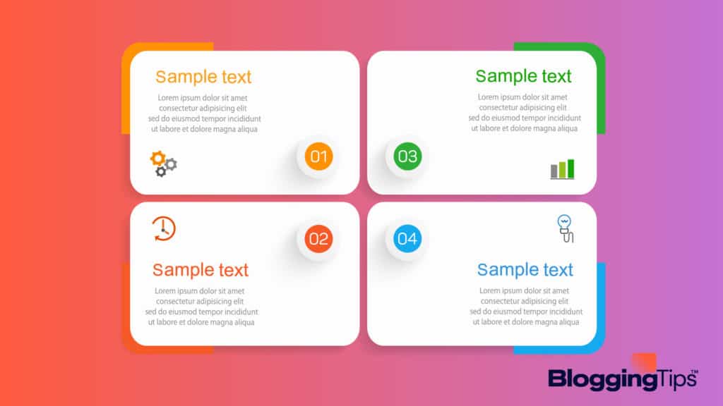
They often have top-down charts and leverage columns and rows to highlight categories of comparison and differences between their subjects. - List Infographics – Infographics that include numbered, easy-to-read tips.
The tips usually have a brief title or header followed by a descriptive paragraph breaking down each tip in more detail.
What Makes an Infographic Design Effective?
As you can see, there are tons of different infographics you can leverage for a presentation, advertisement, or educational content piece like a blog.
But you can’t just whip up a few quick icons, add some bullet points like a list, and assume your infographic will be successful.
Indeed, an infographic design is competitive if its creator uses effective design techniques.
Not to worry; you don’t have to be a master at graphic design to create compelling infographics! Instead, ensure each infographic you create has the below four elements.
Focus
A good infographic has to have a strong focus.
The focus should be present in your item titles, the infographic’s layout, colors and theme, and more.
Not sure whether your infographic is focused enough?
Put yourself in the shoes of a viewer and ask:
- Do you know what the infographic is about?
- Can you clearly see what the infographic means to say by the time you reach the end?
Or are you unsure what the “point” is supposed to be? - Does the infographic “flow” easily?
Determine whether your eyes naturally move from point to point or graphic to graphic on the chart.
Powerful Title
A great infographic should also have a powerful and engaging title.
A good title catches the eyes of audience members and convinces them to read through the rest of the content.
That said, make sure that an infographic’s title isn’t overly long or complex.
The best titles are short, sweet, and to the point, even if the infographic in question distills a complicated topic into a handful of bullet points or pictures.
Compelling Data
Naturally, the best infographics feature compelling data points.
That’s doubly true if you want to make a statistical infographic.
Compelling data includes properly sourced statistics that clearly demonstrate a point one way or the other.
For example, the total number of shark attacks yearly isn’t very interesting.
But the total number of shark attacks per month – and data showing that more shark attacks occurred during summer – is much more compelling.
If you have a lot of data and want to present a point to your audience, consider how to organize the data in a new infographic.
If your infographic is chock-full of confusing numbers, you’ll lose your audience before they begin reading.
For sources, make sure to include them listed at the bottom of your infographic.
Not only does this build audience trust, but it also allows infographic readers to review your sources and verify their legitimacy after the fact.
Easy to Understand
Lastly, every top-tier infographic is easy to understand.
So, if you want your infographics to persuade readers, you should also ensure your graphics are:
- Streamlined
- Informative without being too cluttered
- Designed with a visible, clear font
Ease of understanding is important because readers easily dismiss hard-to-understand infographics.
How Do You Create an Infographic?
You know why infographics are so important and how to ensure your infographics convert visitors into customers or persuade readers to see your perspective.
Now it’s time to dive into the details of infographic creation.
Start with a Brief
First, you need a brief or overall goal for a new infographic. The brief should include:
- The point of the infographic in question
- The information it should contain
- The target audience for the infographic
These points help you determine what type of infographic you should make (as detailed above), plus how you should outline the infographic.
Brainstorm Ideas
Next, sit down with your marketing or design team and brainstorm infographic ideas.
Say that you want to break down your online company’s average traffic worldwide to present the data to a shareholders’ meeting.
The data says that most of your visitors come from the US, while a sizable minority come from China.
You could do an infographic based on geography, for instance.
Or you could do a chart-based infographic highlighting the percentages of each visitor category.
The sky’s the limit, so get creative during this phase!
Creative infographics can be very compelling and persuasive (provided they are still streamlined and focused properly).
Collect Content and Data
You’ll then need to collect the content and data for your infographic.
If you’re lucky, you already have this data ready to go and can simply include references at the bottom as you create the graphics and chart outlines.
If you don’t already have the data, gather it and be sure to verify its legitimacy.
Incorrect data can quickly get you in hot water with your target audience, particularly if your industry is full of experts.
Choose a Type
Now it’s time to choose the type of infographic you want to create.
This should be an easy step, as your infographic brief, ideas and focus, and data type will limit your options and force you to pick between a few.
Use a Program to Put it Together
Once all the above pieces are in place, use an infographic creator program to make the full chart in a matter of minutes.
Some popular infographic creation software options include:
- Canva
- Crello
- Visme
- Genially
- Venngage
- Infogram
- Piktochart
- Easelly
How To Nail Your Infographic Research
Accurate infographic research is key if you want to persuade your audience and avoid making major mistakes.
Good infographics can improve brand authority and audience trust – ones with bad infographic research can do the opposite, leaving your marketing team scrambling.
Doing good infographic research relies on following these key steps.
Check for Relevance
Always check for data relevance – the best way to do that is to check when it was last updated or when it was published.
A study about a modern subject from 1980 isn’t nearly as valuable as a study about the same subject published in 2012, for instance.
Check Intent
You should also check the intent of the people behind published data, especially statistics or scientific conclusions.
Put yourself in their shoes and ask why they would publish the data and whether it is authentic or may have been meddled with.
More broadly, ask yourself whether a publication is an opinion piece, a part of a scientific journal, or something else.
Doing so can give you insight into the intent of the publisher.
Check Opinion vs. Fact
Just to double down on this point, always make sure you consider whether a piece of data is opinion or fact before including it in an infographic.
Opinion pieces are much less reliable.
Check Source Links
Do your due diligence when it comes to including data in an infographic by checking source links.
The most authoritative and trustworthy links usually end in .edu, .gov, and.org.
These all signify that the link in question came from a scientific, educational, or government-run institution.
Check for Accuracy
If you have the time and means to do so, take one extra step and double-check the accuracy of each included source.
Once more, it’s more important to do this if your industry is filled with experts or specialists who can easily point out inaccuracies in your data.
How To Choose the Right Infographic Colors
Infographic colors can heavily impact its aesthetic attractiveness, flow, and focus.
Therefore, choosing the perfect colors for each infographic your team creates is a good idea.
Match Them to the Mood
Always match colors to the current mood of the content piece.
An infographic about ice cream flavors, for instance, might benefit from bright, sugary colors like baby blue, pink, dark chocolate, etc.
Use Brand Colors
You might also consider leveraging your brand’s colors for an official, more professional-looking infographic.
For example, Walmart’s brand colors are blue, yellow, and white, so any official infographics from that organization might also use these shades.
Use Two to Three Colors Only
No matter what colors you choose, limit yourself to two or three colors maximum.
Too many colors clutter up the infographic and make it difficult for your audience to read.
How To Write Compelling Content for Your Infographics
The best infographic written content is punchy, uses simple words and phrases, and doesn’t get overly complicated.
It’s also generally a good idea to use bullet points, especially if you have a lot of charts or graphs.
Bullet points are easy to follow and flow nicely with most small pictures.
How To Improve Your Infographic
After finalizing the first draft of a new infographic, it’s a good idea to have a few people read it and give you their honest impressions.
Ask them:
- What points they took away from the infographic
- Whether they thought the infographic was confusing
- What changes they would make to make the graphic more compelling
Take that feedback into account and consider implementing it depending on its source.
How To Promote Your Infographic
Have a great infographic ready to share with the world?
Fantastic!
Luckily, there are lots of ways to quickly promote it:
- Consider adding a new blog post about the infographic or adding it to an existing blog post
- Make a social media post with the infographic as the highlight
- Make physical posters of your new infographic and put them up around the office
- Take physical photos of the infographic and share them among your social network
Remember, infographics are tools for your brand; use them as often and wherever you need to!
Examples of Great Infographics
Below are some of my favorite infographics that you can use as a reference to design your own.
1. Ways to Improve Back Posture
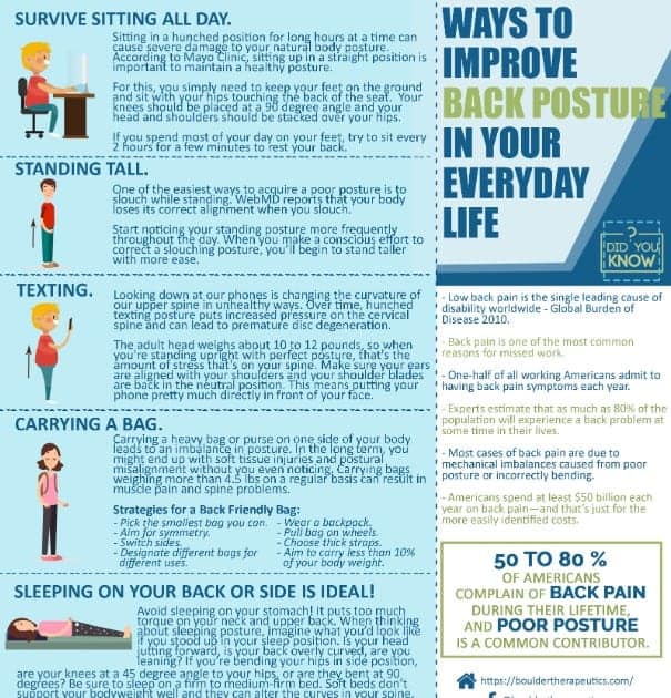
This is a good example of a great infographic because of its readability and design.
The words can easily be read and its thoughts are well laid out.
In other words, anyone can understand what the infographic is all about.
The way this infographic about improving posture is organized also makes it more enticing for viewers to keep on reading.
It follows a dynamic layout where viewers are compelled to read from top to bottom.
2. The Growth of Artificial Intelligence in eCommerce

Single-color themes are also a great way to create a stunning infographic.
See how this effectively utilized the different shades of blue in its background and font.
The robots also reflect what the infographic is all about — artificial intelligence.
It also follows proper spacing as the words and images aren’t clustered in one single spot.
3. How Steve Jobs Started
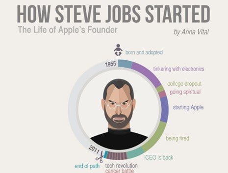
Create a well laid-out timeline of an influential person such as Apple founder Steve Jobs and you’ll have hundreds if not thousands of people sharing your infographic.
As big as a legend he is, there’s no doubt that everyone will take a peek at your infographic.
Apart from that, you can also see how simplicity and proper designing are implemented.
Frequently Asked Questions
What is another word for an infographic?
You might hear infographics referred to by words like chart, storyboard, canvas, and more.
Can I turn a PowerPoint presentation into an infographic?
You can often turn the most important charts or graphs in a PowerPoint presentation into infographics.
But it depends on the content of your PowerPoint presentation and whether you can summarize its information into bullet points on a new chart.
Are infographics only one page?
Usually, yes.
That’s because a one-page limit prevents infographics from becoming too complex.
However, some very dense or technical infographics may call for more than one material page.
Use your best judgment!
Wrapping Up
Infographics are highly valuable tools your brand can’t afford to ignore.
They break down complex information into image or chart-based posters and graphics.
Luckily, now you know how to create high-quality, compelling infographics with a basic set of tools and a few guiding principles.
Share your infographic tips in a comment below, or reach out for further advice!