
We explored the 10 best data visualization tools in 2022 in-depth to help you make the right decision for your business.
We found the best overall solution to be Datawrapper, but read further to find the best solution for your use case.
Best Data Visualization Tools (Overview)
We’ve included an overview of our top picks below. For detailed information on each pick, scroll down.
- Tableau
- Infogram
- Qlikview
- ChartBlocks
- Datawrapper
- Google Charts
- Zoho Analytics
- Visme
- Datapine
- Whatagraph
- Visme
- Datapine
- Whatagraph
An Overview of Data Visualization Tools
Data visualization tools can help you understand information quickly.
These visualizations can provide deep insights in a way that is easier to comprehend than raw data alone.
What Is Data Visualization?
Data visualization is any way of sorting data visually.
Usually, data visualization refers to graphs and charts, but it can also mean heat maps, word maps, and infographics.
Why Is Data Visualization Important?
Data visualization is one of the best ways to get a general grasp of information quickly.
By looking at these depictions of data, you can also understand general trends and patterns without running a full-scale data analysis.
Best Data Visualization Tools
We’ve found the ten best data visualization tools available and thoroughly researched the best and worst parts of each one.
We discovered that Datawrapper is the best overall, but our complete analysis is available below.
Tableau
Overview: Tableau is one of the leading businesses in data visualization.
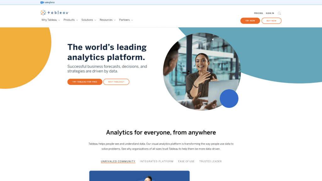
It can handle massive datasets and rarely has performance issues, but it is limited in its data processing and is more expensive than most competitors.
Our Rating: 4.5 stars
Best For: Users analyzing large amounts of data
Notable Features
Tableau is one of the top industry leaders in data visualization, and they’ve gotten there for a reason.
Tableau’s security features are unbeatable, so your data will always be safe in their programs.
Pros
- A quick way to create interactive visualizations: Tableau has a simple drag-and-drop way of creating interactive visualizations.
- Handles large amounts of data: If done strategically, Tableau has been able to handle billions of rows of data.
This amount of data can be extraordinarily difficult to manage, much less analyze, but Tableau can do both. - Mobile support: Tableau has mobile apps for both iOS and Android.
The apps make it easy to check your data anytime, anywhere. - Minimal performance issues: Tableau’s limitations are truly minimal.
Users rarely report performance issues. - Easy to upgrade: It is simple to upgrade users to new tiers in Tableau.
Cons
- Limited data processing: While Tableau is great for visualizing data, hard analytics, data transformation, and modeling features are lacking.
- Expensive: While Tableau is one of the best data visualization software on the market, it’s also one of the most expensive.
Is Tableau Hard To Use?
No, Tableau is one of the most intuitive and easy-to-understand data visualization software available.
While some users report a bit of a learning curve, once you have a grasp on the essentials, Tableau should be simple for most users.
Pricing and Plans
Tableau offers a variety of plans, but the Explorer and Viewer plans are only available if another user in the enterprise is a tableau creator.
Individuals will only have access to the Tableau Creator plan.
- Tableau Creator, $70/month per user, billed annually: The creator tier allows users to access all of Tableau’s features, from data preparation to visualization.
This tier includes Tableau Desktop, Tableau Prep Builder, and a creator license on Tableau Cloud. - Tableau Explorer, $42/month per user, billed annually: Users at this tier will be able to manage content and other users (with permission), download complete datasets, and create visualizations. They will not be able to create data sources or perform administrative duties.
- Tableau Viewer, $15/month per user billed annually: Viewers will have access to created visualizations and summary data but will not be able to prepare or govern any data.
Our Take
Tableau does well with even the most massive datasets and works well for large organizations.
For individuals or small businesses, there are far more suitable alternatives that cost significantly less money.
Large companies or organizations with datasets in the millions will not find a better or more reliable alternative to Tableau.
Infogram
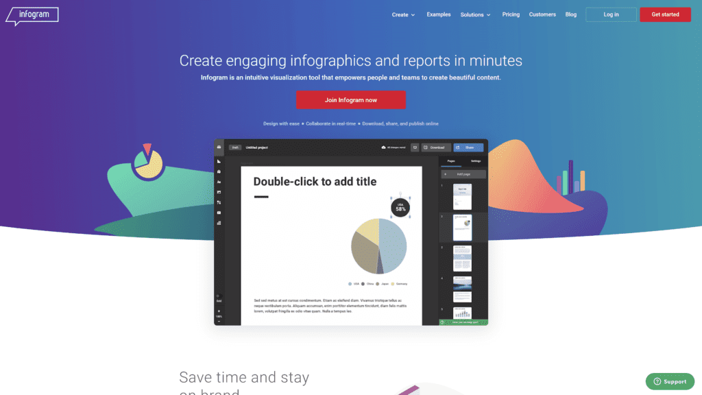
Overview: Infogram is software that helps users create infographics, maps, reports, charts, and posters.
Our Rating: 4 stars
Best For: User-friendly interface
Notable Features
Infogram makes sharing your infographics and charts simple, as they have conversion into PDF, JPG, and GIF formats.
Pros
- User-friendly interface: Like Tableau, Infogram has simple drag-and-drop functionality.
Most users report that Infogram is easy to learn and simple to use. - Saves you time: Simple chart tools will save you time learning more complicated software.
- Variety of graphic elements, charts, and visualizations: Infogram has more than 37 customizable charts and 550 customizable maps, creating endless options for you to work with.
- Has integration options: You can integrate Infogram with Google Drive, Youtube, Vimeo, Giphy, Iframe, and more.
- Extensive graphic library: Infogram has more than one million icons and images you can use to customize your infographics and charts.
Cons
- Minimal control over graphics: The premade templates are difficult to customize, and free users can’t change much.
- It can only be used online: You will need an internet connection to run Infogram.
Most of the time, this isn’t an issue, but if you’re traveling while creating and your connection isn’t consistent, it may become a problem.
Is Infogram Hard To Use?
No, Infogram has a simple and intuitive UI.
Pricing and Plans
- The basic version, free: Up to ten projects and up to five pages per project.
All creations made with the free version will have the Infogram logo on them.
Limited access to templates. - Pro, $19/month billed annually: Up to 100 projects and up to ten pages per project.
Full access to templates, privacy controls, and graphics library. - Business, $67/month billed annually: Up to 1,000 projects with unlimited pages per project.
You can have your logo as a ready-to-use asset and create color palettes based on your brand. - Team package, $149/month billed annually: Up to 3,000 projects, real-time collaboration, link tracking, and single team functionality.
Our Take
Infogram is a great beginner option. It’s easy to use and integrates with most other platforms.
It’s the perfect choice for creating graphics you’re going to use on social media or share with a general audience.
Infogram cannot handle the amount of data that Tableau can, and it is not designed for complex data visualization.
Qlikview
Overview: Qlikview offers deep analytics and visualization tools to help you distribute information and gain insights.
Our Rating: 3 stars
Best For: Data compression
Notable Features
Qlikview offers some of the best cloud storage and data sharing of any of the services listed here.
Their smart analytics can help you understand the data that you’re sharing as well.
Qlikviews automatically scheduled data updates will also save you tons of time.
Pros
- Allows for data sharing: You can use Qlikview to store and share data in the cloud securely.
- Low maintenance: You can set Qlikview to update your data on a set schedule, saving you time and energy.
- Fast: Qlikview has a drag-and-drop functionality to create visualizations quickly.
- Data Compression: Qlikview does an excellent job of compressing your data to reduce the amount of space used.
- Cost-Effective: Qlikview is reasonably priced for the features and tools you get.
Cons
- Poor customer support: Many users report being unhappy with the customer support that Qlikview offers.
- Features old functions: Qlikview only recently adopted things that have been standard practice for years, such as drag-and-drop creation.
Is Qlikview Hard To Use?
Qlikview has a steeper learning curve than other options explored here.
However, once you grasp how to use Qlikview, it should be relatively easy for you to use.
Pricing and Plans
- Qlik Sense Business, $30/month per user, billed annually: This plan is for smaller teams and will get you all of the features of Qliksense.
- Qlik Sense Enterprise, custom pricing: Qlikview offers custom pricing models for larger businesses and enterprises.
Enterprise plans will also get you all of the features that Qliksense has to offer.
Our Take
Qlikview is best for those with large amounts of data that need some way of compressing that data to save space.
Qlikviews cloud storage is a much better deal than most of its competitors, but it lacks creative visualizations and customer support.
ChartBlocks
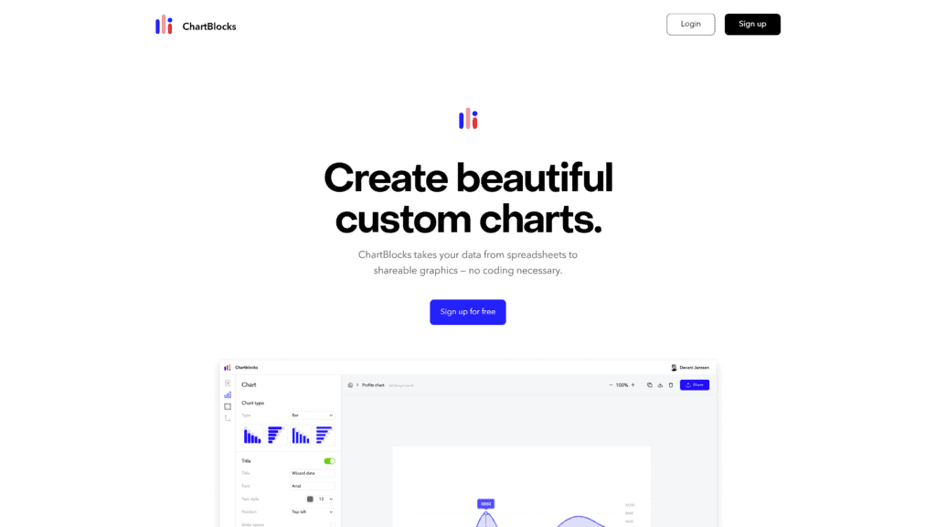
Overview: ChartBlocks is a data visualization software service
Our Rating: 3 stars
Best For: Easy-to-use dashboard
Notable Features
ChartBlocks is a minimalist service that is entirely free.
You can upload your data directly from a CSV file or Excel file in minutes.
Pros
- Seamless data importation: You can import your data into ChartBlocks directly from a CSV or Excel file.
- Charts are shareable: ChartBlocks offers some of the easiest-to-use sharing features of any of the options listed here.
- The dashboard is easy to use: The dashboard itself on ChartBlocks is easy to navigate because there isn’t much to look through.
- Features a free plan: Not many data visualization services have a free version, but ChartBlocks offers you lots of functionality without any cost.
- Excellent layout: ChartBlocks has a clean, minimalist layout that makes your data stand out.
Cons
- Limited Customization: There aren’t a ton of customization options in ChartBlocks. Things like changing fonts or more in-depth color options just don’t exist.
- Navigating functions is complicated: Some of ChartBlocks’ functions are clunky and difficult to understand.
Is ChartBlocks Hard To Use?
ChartBlocks has a sleek-looking UI, but it’s not always the most intuitive.
Importing data into ChartBlocks is easy, but building charts can be tricky.
Pricing and Plans
- Free: All of ChartBlocks’ services are available for free.
Our Take
ChartBlocks offers a small selection of charts and graphs that you can make by inputting your data.
It’s quick, easy, and free.
However, they don’t offer the customization or depth that other services provide.
Datawrapper
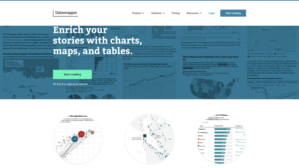
Overview: Datawrapper allows you to make charts, maps, and tables quickly and easily.
Our Rating: 4.5 stars
Best For Flexibility
Notable Features
The free version of Datawrapper is more than adequate for most people.
At all tiers, including the free tier, you can create visualizations that are publishable and clean.
Pros
- Easy, simplified UI: Datawrapper intentionally chooses charts and maps that are easy to use.
They’ve even gone so far as to say that they avoid implementing additional features that may confuse casual or new users. - Features design flexibility: If you are subscribed to a higher tier, Datawrapper has some of the best design flexibility on the market.
- Conveniently straightforward: Datawrapper’s UI and building features are easy and quick to use.
You don’t need to know any coding to use Datawrapper. - Free plan: You can get most of the features of Datawrapper completely for free.
- Can view data on the BI tool of your choice: If you’re subscribed to Datawrapper at higher tiers, their export file options make it easy to integrate your visualizations into other software.
Cons
- Limited color customization: The free version of Datawrapper does not allow you to customize themes, fonts, or colors.
- Difficult to store data: Datawrapper does not have the same data storage options as other services.
Is Datawrapper Hard To Use?
No, Datawrapper is easy to use and requires very little additional training.
Pricing and Plans
- Free: The free version of Datawrapper allows you to create and publish visualizations and export them to PNG.
Everything you create with the free version will have the Datawrapper logo on it. - Custom, $599/month: Includes access to all features for 10 users, and you can add additional users for $21/month each.
Can export files to PNG, SVG, and PDF without logos or watermarks. - Enterprise, custom pricing: Includes all features of Datawrapper.
Enterprise plans are for teams of 25 or more.
Our Take
Datawrapper is perfect for getting simple jobs done.
If you want to share visualizations on social media or with clients, other software that allows for free customization might be a better fit.
For visualizations that need to be shared within teams, however, Datawrapper is perfect.
Google Charts
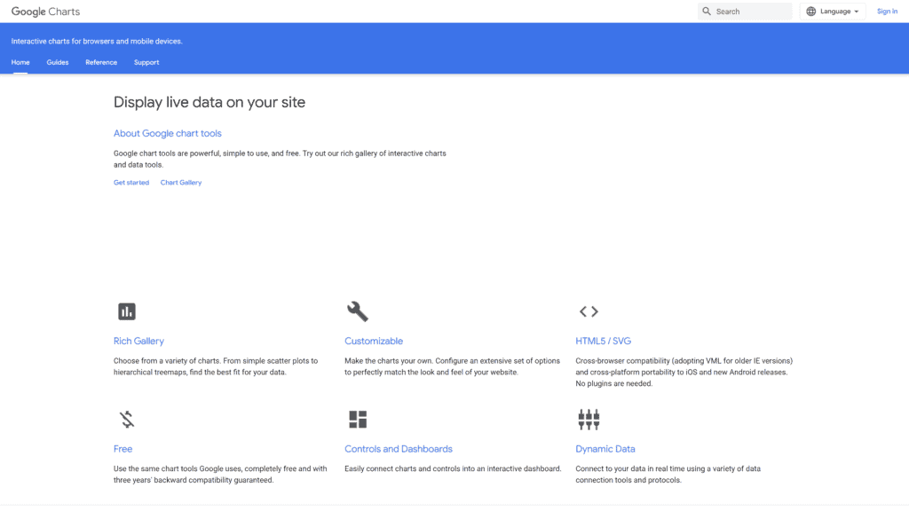
Overview: Google Charts is a visualizer tool that integrates seamlessly with other Google products.
Our Rating: 4 stars
Best For: Various charts
Notable Features
Google Charts works flawlessly with other Google tools and products.
It’s easy to use and completely free.
The community-contributed charts mean that you can make almost any visualization you want.
Pros
- Aesthetic appeal: The charts that you can design with Google Charts are clean, sleek, and timeless.
- Easy to use: Google Charts is designed with the most casual users in mind.
You will find that building visuals with Google Charts is accessible regardless of your skill level. - Has chart variety: Google Charts has many charts to choose from.
- Integrated with Gsuites products: As a Google product, it’s simple and easy to integrate Google Charts with other Google products such as Google Sheets.
- Impressive Graphics: Google sources templates from the community, meaning tons of gorgeous free options are available.
Cons
- No offline access: You’ll need internet access to use Google Charts.
While this is rarely an issue, it may become a problem if you take your work with you while you travel and don’t have a consistent connection. - Chart embedding is tricky: You will likely need some coding knowledge to embed a Google chart into your website.
Is Google Charts Hard To Use?
No, it is not difficult to create a chart with Google Charts.
They offer a step-by-step walkthrough and easy integration with other Google tools.
Pricing and Plans
- Free: Google Charts is free for all users, all the time.
Our Take
Google Charts is easy to use but challenging to share.
If you’re looking for a free option to use for your purposes, Google Charts is a good choice.
If you don’t have a lot of coding knowledge and you want to embed your visualizations into your website, there are easier tools that you can use.
Zoho Analytics
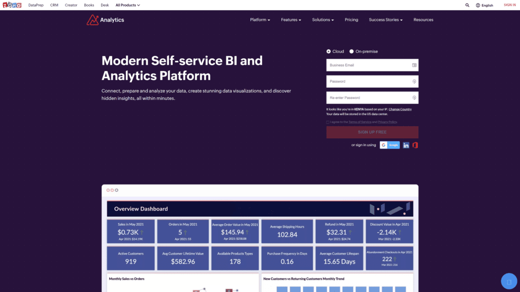
Overview: Zoho Analytics can help you prepare, analyze, and share your data in sleek visualizations.
Our Rating: 4.5 stars
Best For: Detailed reports
Notable Features
Zoho Analytics integrates with other platforms easily and offers some of the best support in the business.
Pros
- Customizable reports and dashboards: You can customize Zoho Analytics to display what’s most important to you.
- Excellent Support: Users report being happy with support when they need it.
- Affordable: Zoho Analytics is reasonably priced for what you get.
- Efficient Interface: Their main interface offers your most needed tools, all in one place
- Easy Integration: Zoho integrates with most other platforms without issue.
Cons
- Requires coding knowledge: To get the most use out of Zoho Analytics, you will need some understanding of coding languages.
- Merging datasets presents a challenge: It can be difficult to merge different datasets.
Is Zoho Analytics Hard To Use?
Compared to other services, yes, Zoho Analytics is hard to use.
You will need more foundational knowledge to use Zoho Analytics effectively.
Pricing and Plans
- Basic, $24/month billed annually: Two users, 500k data rows
- Standard, $48/month billed annually: Five users, 1 million data rows
- Premium, $115/month billed annually: 15 users, 5 million data rows
- Enterprise, $455/month billed annually: 50 users, 50 million data rows
Our Take
Zoho Analytics is worth learning how to use.
It can help you build amazing visuals while helping you understand what those visuals mean.
Visme
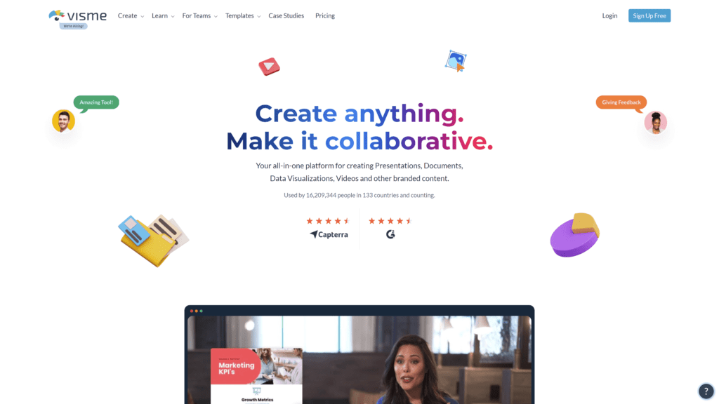
Overview: Visme is a visualization builder perfect for beginners that want to make stunning designs.
Our Rating: 4 stars
Best For: Customer service
Notable Features
The free version will allow you to try Visme and see if it will suit your needs before upgrading.
Higher levels of Visme offer large amounts of data storage for a reasonable price.
Pros
- Ideal for business presentations: The engaging and exciting visuals you can create with Visme are perfect for business purposes.
- Excellent customer service: Users who have needed assistance with Visme report getting the help they needed quickly and effectively.
- Engaging: The visualizations you can make with Visme are stunning and will keep your audience’s attention.
- Efficient and easy: Visme is simple and easy to use.
- Cost-effective: Visme offers excellent features for the price.
Cons
- Customization limitation: Limited amounts of customization are available with Visme.
- Limited themes in the free version: The number of themes offered in the free version doesn’t keep pace with the themes you can get in other free services.
Is Visme Hard To Use?
No, Visme is easy to use, even without much experience making visualizations.
Pricing and Plans
- Basic, free: 100MB storage, limited templates
- Personal, $12.25/month billed annually: 250MB storage, JPG, PNG, and PDF
- Business, $24.75/month billed annually: 3GB storage, full download options
Our Take
Though you can make some great-looking visualizations with Visme, if you’re an expert or want to explore your design options more in-depth, you may find Visme limiting.
Datapine
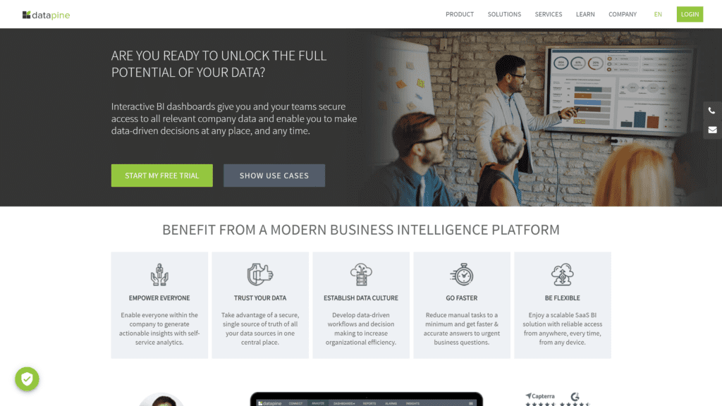
Overview: Datapine allows you to integrate data sources and offers advanced analytics.
Our Rating: 3.5 stars
Best For: Data sources
Notable Features
Datapine offers intelligent alarms for premium users that alert you as soon as certain thresholds are met.
Datapine has some of the best data reporting of all the options explored here.
Pros
- Amazing chart library: Datapine has tons of chart options.
- Good dashboard reports: Datapine can synthesize and provide you with the most essential information on your dashboard.
- Efficient interface: The clean interface and sleek UI make fast work of creating visualizations.
- Easily connected data sources: You can combine multiple data sources in Datapine, making for more accurate data reporting.
- Fast performance: Datapine can work with your data quickly and efficiently.
Cons
- SQL mode is complex: Some of the most advanced options will not be usable for many users.
- Expensive: Datapine costs far more than most competitors.
Is Datapine Hard To Use?
Datapine is not as easy to use as some alternatives but is possible to learn and understand with effort.
Pricing and Plans
- Basic, $249/month: 1 user, 3 data sources
- Professional, $449/month: 2 users & viewers, interactive dashboard, and sharing options
- Premium, $799/month: 3 users & viewers, data monitoring
- Branding & embedded, $1099/month: 3 users & viewers, embedded dashboards, and branding
Our Take
If you have multiple data sources and you need software that can synthesize and analyze them, Datapine is the best option available.
It is not a good software for beginners without SQL experience.
Whatagraph
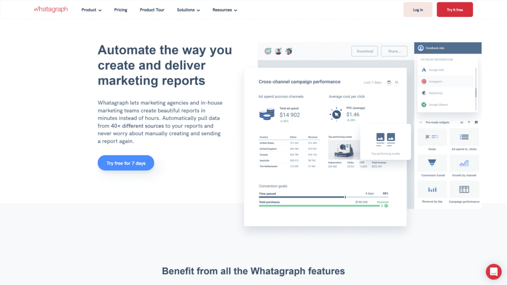
Overview: Whatagraph can integrate data from multiple sources, provide analytics reports, and create visualizations you can share.
Our Rating: 4 stars
Best For: Data integration
Notable Features
Whatagraph has custom branding for high-level subscribers, integration with other BI software, and data monitoring.
Pros
- Attractive start-up: Excellent user interface upon opening.
- Excellent customer support: Whatagraph has some of the best support in the industry.
- Saves time: The simplicity of Whatagraph will save you time in creating visualizations.
- Good quality reports: Whatagraph synthesizes relevant information in their reports.
- User-friendly interface: Whatagraph has a clean UI that is easy to use.
Cons
- Constructing your modules can be challenging: Some users report that creating complex visualizations can be difficult
- 30-day cancellation policy: Whatagraph requires that you inform them of your cancellation 30 days in advance, often resulting in an additional monthly payment.
Is Whatagraph Hard To Use?
While some of its offerings are challenging, the platform is easy to use once you’re over the steep learning curve.
Pricing and Plans
- Professional, $199/month billed annually: 5 users, 25-50 data sources
- Premium, $299/month billed annually: 10 users, 50-100 data sources
- Custom pricing: Custom pricing has all the same features as premium, with added onboarding sessions and 100+ data sources
Our Take
Whatagraphs has the same level of data integration from multiple sources as Datapine for a lower price.
Features To Look for in Data Visualization Tools
You can save time and money by knowing what to look for in a visualization tool before you buy.
Clear, Concise, and Customizable Dashboard
Your dashboard is the part of the software you will see most, and use the most often.
You want something that works for you in your current workflow and isn’t bogged down with extra material you don’t need.
Interactive Reporting
Look for a tool that tells you what you’re looking at.
You want to choose software that everyone can understand and use, not just your data experts.
Data Collection and Sharing
Data is no good in the hands of just one person, so sharing features is essential in visualization software.
Your visualization tools should be able to collect the most critical data from your raw data as well to save you time.
AI Integration
As AI becomes more advanced, it is often tasked with interpreting and analyzing data.
AI can do a better job of reading data and analyzing it without bias.
Frequently Asked Questions
Still not sure which tool is the best for you?
Let’s look at some commonly asked questions!
Why do we use data visualization?
Data visualization is used to create fast, deep insights into data.
What are data visualization techniques?
Any visual representation of data, whether a graph, chart, or matrix, is a data visualization technique.
How to choose the best data visualization tools?
Choosing the correct data visualization tool depends on understanding what you need to represent in your data.
For example, data collected over time is best described by a line graph, but a line graph would be useless for understanding where sales are coming from.
Conclusion
The very best data visualization tool for 2022 is by far and away Datawrapper.
Datawrapper is free, secure, simple, and flexible.
While the customization is slightly lacking in the free version, most people will find their sleek designs do just fine.
Our runner-up is Tableau, which is perfect for those exploring vast amounts of data.
Our favorite tool for beginners is Infogram.